


Two Colour Combination for Living Room
Two colour combination for living room planning often feels overwhelming because advice online jumps straight into trends without explaining the structure behind good design. Before selecting paint, it helps to understand the logic that shapes proportion, contrast and balance. The principles explored in this article move beyond surface styling and focus on how colour ratios, pairing decisions and placement strategies influence the overall atmosphere. By grounding your decisions in design principles and proportion awareness, you reduce costly mistakes and create a scheme that feels considered rather than experimental.

How Proportion Frameworks Shape Everyday Interiors
From the 2/3 layout rule to the 70 20 10 distribution method, proportion frameworks quietly determine whether a room feels settled or chaotic. These ratios guide how dominant tones, supporting shades and accent details interact across walls, upholstery and flooring. When applied correctly, they establish visual hierarchy and prevent colour from competing for attention. For homeowners working with existing furniture or rugs, understanding these frameworks makes it easier to integrate new shades without disrupting the overall balance.
Choosing Complementary Tones With Confidence
Selecting two colours that work together is rarely about popularity. Successful pairings depend on undertones, light direction and how materials reflect colour throughout the day. Warm neutrals can soften cooler accents, while deeper shades introduce contrast without darkening the space. Paying attention to undertone compatibility and light responsiveness ensures that combinations feel cohesive across changing daylight conditions, especially in UK homes where natural light varies seasonally.
Avoiding Common Colour Conflicts and Overpowering Contrasts
Not every pairing enhances a living room. Clashing undertones or overly saturated shades used in equal proportion can create unnecessary tension. The blog explores how imbalance, rather than colour choice alone, often causes discomfort. By considering tonal balance and contrast control, you can avoid schemes that feel visually exhausting. This awareness is particularly valuable when layering rugs, cushions and decorative elements that add further colour complexity.
Applying Structured Decorating Methods to Real Homes
Rules such as the 3-5-7 grouping approach or the 80 20 colour method are not rigid formulas but practical tools. They help structure shelves, seating areas and wall accents so that the space feels curated rather than cluttered. These methods encourage intentional placement and support cohesive styling, allowing decorative pieces to enhance rather than overwhelm the room. For budget-conscious buyers, this means working smarter with what you already own rather than constantly replacing items.
Building a Cohesive Living Room From Wall to Floor
Ultimately, colour decisions do not exist in isolation. Wall tones interact with flooring, upholstery and soft furnishings, influencing how spacious and inviting a room feels. A thoughtful two-tone approach works best when supported by texture at floor level, whether through a subtle neutral rug or a patterned design that anchors the scheme. By combining colour strategy with textural integration, you create a living room that feels layered, balanced and practical for everyday UK living.
10 Best Two Colour Combination for Living Room That Elevate Everyday Interiors
10 best two colour combination for living room ideas can completely reshape the atmosphere of your space without replacing furniture or altering layout. The right pairing influences how natural light behaves, how spacious the room feels and how confidently you can layer rugs, cushions and upholstery. In many UK homes, the living room is multifunctional, so colour choices need to feel both stylish and practical.
Below are combinations that offer visual balance while supporting real-life living.

Beige and Warm White for Soft Contrast and Layered Warmth
Beige and warm white create a nuanced neutral base that feels refined rather than flat. Beige adds visual substance to walls, while warm white prevents the scheme from feeling dull or yellowed. The subtle contrast allows architectural details such as alcoves or panelling to stand out without harsh lines.
This pairing works particularly well in rooms that rely on textured materials. Boucle sofas, linen curtains and woven storage pieces gain dimension against this backdrop. A cream or lightly patterned rug enhances the layered warmth, helping the space feel cohesive rather than monochrome. It is a dependable option for homeowners who want longevity without sacrificing softness.
Sage Green and Cream for Relaxed Sophistication and Natural Harmony
Sage green introduces colour in a restrained, liveable way. Unlike brighter greens, it absorbs light gently, creating a composed and welcoming atmosphere. Cream offsets sage without creating sharp contrast, allowing the room to feel airy while maintaining personality.
This combination pairs beautifully with oak coffee tables, rattan details and understated décor. A neutral rug with subtle texture strengthens the natural harmony, especially in family spaces where visual calm matters. The result feels intentional rather than decorative, offering a sense of relaxed sophistication that remains easy to style season after season.
Grey and Off-White for Modern Clarity and Visual Balance
Grey and off-white remain popular because they offer dependable structure without overwhelming the senses. Off-white softens grey’s cooler undertone, preventing the room from feeling clinical. Together they form a clean canvas that suits both contemporary and transitional interiors.
This palette becomes particularly effective when paired with statement flooring. A geometric or shaggy rug adds personality while the walls provide visual balance. The restrained backdrop also allows metallic lighting or bold artwork to stand out. For homeowners who prefer subtle foundations with room to experiment, this combination delivers modern clarity without rigidity.

Navy and Soft Beige for Depth and Dimension and Grounded Elegance
Navy introduces weight and architectural presence to a living room. Used on a feature wall or within alcoves, it anchors the space and adds dramatic undertones. Soft beige counteracts the intensity, ensuring the overall feel remains inviting rather than heavy.
Layering textiles becomes especially impactful here. Cushions in lighter neutrals, alongside a textured rug, create depth and dimension across the room. The beige prevents navy from dominating, achieving a balanced and grounded elegance that works well in larger living areas or homes with generous natural light.
Blush Pink and Light Grey for Gentle Warmth and Contemporary Softness
Blush pink adds warmth without overpowering the room, especially when chosen in muted tones rather than vibrant shades. Light grey introduces restraint, keeping the palette from feeling overly delicate. The interaction between the two produces a refined, balanced aesthetic.
When combined with understated flooring, such as a neutral polypropylene rug, the result feels polished rather than playful. This pairing suits homeowners seeking contemporary softness while maintaining grown-up styling. The subtle colour shift also enhances layered lighting, amplifying a sense of gentle warmth in the evenings.
Olive Green and Taupe for Earthy Depth and Textural Interest
Olive green carries richness that feels grounded and mature. Taupe, positioned between grey and brown, provides stability and cohesion. Together they create an earthy scheme that feels connected to natural materials.
This combination complements wooden furniture, woven baskets and linen upholstery. A jute-look or textured rug amplifies the textural interest, strengthening the organic direction of the room. The layered tones introduce earthy depth without veering into dark territory, making the space feel cosy yet composed.
Charcoal and Crisp White for Architectural Impact and Clean Definition
Charcoal offers strong framing within a living room, particularly when used to highlight fireplaces, shelving or a single feature wall. Crisp white lifts the scheme, ensuring the contrast feels intentional rather than stark.
Strategic placement is key. In smaller rooms, limiting charcoal to controlled areas prevents visual heaviness. A lighter rug softens the transition between dark walls and flooring, enhancing clean definition without overwhelming the space. This pairing provides architectural impact for those who prefer sharper contrast and contemporary styling.
Teal and Light Stone for Vibrant Balance and Controlled Colour
Teal introduces personality and energy, yet pairing it with light stone ensures the room remains cohesive. The stone tone tempers teal’s intensity, making it suitable for everyday living rather than occasional statement use.
A patterned rug incorporating subtle blue or neutral flecks strengthens the vibrant balance, tying walls and furnishings together seamlessly. This palette works particularly well in homes where colour confidence is present but controlled colour is still valued. The outcome feels expressive while maintaining controlled colour discipline.
Terracotta and Cream for Inviting Warmth and Subtle Rustic Appeal
Terracotta carries warmth reminiscent of clay and natural pigments. When balanced with cream, it becomes approachable rather than bold. The warmth reflects beautifully under soft lighting, especially in period properties or character homes.
Layered textiles, such as knitted throws or neutral rugs, enhance the inviting warmth and prevent the tone from feeling overwhelming. This pairing introduces subtle rustic appeal without committing to a full traditional scheme, making it versatile for both classic and modern interiors.
Soft Blue and Pale Grey for Airy Openness and Light Reflection
Soft blue promotes tranquillity and visual openness. Pale grey grounds the scheme, adding structure without stealing light. Together they create a breathable palette suited to both compact and spacious living rooms.
In daylight-heavy spaces, the colours enhance light reflection, making the room feel larger. A neutral rug with minimal pattern maintains airy openness while providing practical comfort underfoot. This pairing is particularly effective for homeowners seeking calm interiors that still feel contemporary.
The 10 best two colour combination for living room options above demonstrate that balance is everything. Thoughtful colour pairing becomes even more effective when supported by the right flooring choice.
Modern Two Colour Combination for Living Room That Define Contemporary UK Interiors
Modern two colour combination for living room schemes are no longer about sharp contrasts alone. Today’s interiors lean towards controlled layering, subtle tonal shifts and combinations that allow furniture and rugs to integrate seamlessly. In many UK homes where open-plan layouts are common, colour pairings must create flow without feeling repetitive.
Below are contemporary combinations designed to feel relevant, adaptable and easy to style around practical flooring.

Greige and Soft White for Refined Minimalism and Seamless Backdrop
Greige, sitting between grey and beige, delivers balance without temperature extremes. Paired with soft white, it creates a fluid canvas that avoids harsh contrast while still offering visual structure.
This pairing suits living rooms where texture carries the design weight. A subtly patterned rug or low-pile neutral design becomes part of the architecture rather than a separate statement. The result is refined minimalism supported by a seamless backdrop that works equally well with modern sofas or classic silhouettes.
Deep Forest Green and Warm Ivory for Layered Contrast and Modern Depth
Forest green introduces contemporary richness, particularly in rooms with generous ceiling height or natural light. Warm ivory softens its intensity, ensuring the space remains inviting rather than dramatic.
When combined with light-toned flooring or a textured rug, the contrast feels intentional. Cushions and throws in complementary neutrals prevent the green from dominating. This scheme offers modern depth while maintaining layered contrast, ideal for homeowners seeking character without sacrificing warmth.
Slate Blue and Muted Taupe for Calm Sophistication and Balanced Undertones
Slate blue brings cool composure, while muted taupe stabilises the palette with subtle warmth. Together they create an understated pairing that feels elevated but never overdesigned.
This works particularly well in living rooms styled with metallic lighting or glass tables, where reflective surfaces benefit from grounded tones. A neutral rug with delicate pattern can unify both colours, enhancing balanced undertones and reinforcing a sense of calm sophistication.
Charcoal Grey and Light Sand for Contemporary Structure and Visual Softening
Charcoal grey provides modern framing, especially when used to define alcoves or media walls. Light sand prevents the room from becoming too stark, offering warmth without turning yellow.
A plush or textured rug in a mid-neutral shade bridges the two tones effortlessly. The darker shade delivers contemporary structure, while the lighter tone ensures visual softening, particularly important in compact UK living rooms where heavy colours can shrink perception of space.

Muted Terracotta and Pale Stone for Urban Warmth and Subtle Texture Play
Muted terracotta adds warmth that feels curated rather than rustic. Pale stone keeps the palette grounded, preventing the colour from overwhelming the room.
This combination pairs beautifully with natural wood furniture and woven accents. A jute-look or polypropylene rug introduces durability while amplifying subtle texture play across the floor. The scheme radiates urban warmth suited to modern flats and renovated terraces alike.
Ink Blue and Crisp Off-White for Defined Edges and Architectural Balance
Ink blue creates striking definition when used strategically, especially on a single wall or built-in shelving. Crisp off-white brightens surrounding surfaces, preventing the darker shade from absorbing too much light.
Layering neutral soft furnishings ensures cohesion. A light-coloured rug prevents the base of the room from feeling heavy, contributing to architectural balance and maintaining defined edges without visual clutter.
Olive Grey and Warm Cream for Subdued Modernity and Natural Continuity
Olive grey blends organic tones with contemporary restraint. Warm cream introduces softness that keeps the scheme approachable.
This pairing is particularly effective in homes incorporating indoor plants or natural textures. A neutral rug reinforces natural continuity, while the restrained colour choice ensures subdued modernity that feels effortless rather than trend-driven.
Soft Mocha and Misty Grey for Gentle Contrast and Harmonised Palette
Soft mocha brings warmth that complements wooden furniture and leather accents. Misty grey counterbalances it, preventing the room from feeling overly earthy.
A medium-pile rug in a coordinating neutral tone ties both colours together at floor level. The pairing achieves gentle contrast within a harmonised palette, allowing homeowners to layer cushions and décor without visual tension.
Dusty Rose and Putty Beige for Understated Character and Warm Light Reflection
Dusty rose adds personality while remaining muted enough for everyday use. Putty beige ensures the colour feels grounded rather than decorative.
When paired with subtle patterned flooring, this scheme enhances warm light reflection, particularly in north-facing rooms. The result carries understated character that feels thoughtful and mature rather than overtly feminine.
Midnight Teal and Soft Grey for Modern Drama and Controlled Boldness
Midnight teal introduces richness and personality. Soft grey provides stability, ensuring the room retains clarity.
A textured or lightly patterned rug in grey-based tones prevents colour overload and keeps the scheme cohesive. This pairing delivers modern drama through controlled boldness, suitable for homeowners who want contemporary presence without overwhelming their living space.
A modern two colour combination for living room design succeeds when it supports furniture, textiles and practical flooring rather than competing with them.

Two Colour Combination for Living Room Walls That Create Cohesive Interior Flow
Two colour combination for living room walls decisions influence how spacious, balanced and layered your living area feels. Walls are not just background elements. They frame your furniture, shape how light moves across the room and determine how confidently you can introduce rugs, textiles and decorative pieces. In many UK homes where living rooms serve multiple purposes, wall colour pairing must feel intentional and practical.
Below are thoughtfully structured combinations designed specifically for walls rather than general décor.
Light Taupe and Warm White for Subtle Zoning and Soft Transitions
Light taupe adds depth without darkening the room. When paired with warm white on adjacent or connecting walls, it creates gentle variation that helps define seating areas without harsh contrast.
This approach works especially well in open-plan living spaces where you want visual separation without physical dividers. Taupe behind the sofa can anchor the seating zone, while warm white keeps surrounding walls bright. A neutral rug strengthens subtle zoning, ensuring soft transitions between areas while maintaining an airy feel.
Powder Blue and Pale Grey for Airy Structure and Balanced Coolness
Powder blue introduces lightness and calm. Pale grey stabilises the scheme, preventing it from becoming overly pastel.
Used strategically, blue can highlight architectural features such as alcoves or chimney breasts, while grey maintains composure on larger surfaces. Flooring in neutral tones supports airy structure, helping the space feel open yet grounded. The pairing achieves balanced coolness without drifting into cold territory.
Olive Green and Soft Cream for Layered Depth and Natural Flow
Olive green applied to a feature wall creates visual grounding. Soft cream across remaining walls lifts the room and reflects natural light.
This pairing works particularly well in living rooms with wooden furniture or woven accents. A textured rug at floor level reinforces natural flow, connecting walls to furnishings. The green provides layered depth, while cream ensures the overall atmosphere remains welcoming rather than intense.
Muted Clay and Off-White for Warm Framing and Visual Comfort
Muted clay tones add warmth that feels contemporary rather than rustic. Off-white ensures the room remains bright and breathable.
When clay is positioned behind shelving or media units, it creates warm framing that highlights decorative elements. A soft neutral rug introduces visual comfort, preventing the richer tone from overwhelming the space. This combination is particularly effective in period homes where character features benefit from enhanced contrast.
Charcoal Accent and Light Beige for Defined Focal Points and Modern Clarity
Charcoal, used sparingly, establishes strong focal areas. Light beige balances it, ensuring the room retains warmth.
Placing charcoal on a single wall behind the television or fireplace creates defined focal points without reducing perceived space. Beige surrounding walls soften the overall effect, delivering modern clarity that feels structured yet approachable. Pairing this scheme with a lighter rug prevents heaviness at floor level.

Sage Green and Chalk White for Fresh Layering and Calm Definition
Sage green introduces colour while maintaining softness. Chalk white enhances brightness and ensures clean contrast.
This pairing is particularly suitable for living rooms receiving limited daylight, as white reflects available light effectively. A neutral rug strengthens fresh layering, while the green offers calm definition that feels refined rather than decorative.
Dusty Pink and Stone Grey for Gentle Contrast and Controlled Warmth
Dusty pink, when muted, acts as a warm neutral rather than a statement shade. Stone grey counterbalances it with understated coolness.
Applying pink to a feature section and grey to larger surfaces produces gentle contrast that feels grown-up and subtle. A textured rug can bridge the tones, enhancing controlled warmth while keeping the scheme cohesive.
Deep Teal and Soft Sand for Rich Dimension and Light Management
Deep teal creates impact when concentrated on one primary wall. Soft sand prevents the room from becoming too dark by maintaining brightness on surrounding surfaces.
This pairing excels in rooms with strong daylight, as the sand tone assists with light management, reflecting brightness while teal provides rich dimension. A neutral or lightly patterned rug ensures the floor remains visually connected to both tones.
Mist Grey and Warm Oat for Understated Harmony and Textural Potential
Mist grey introduces subtle coolness without overwhelming the space. Warm oat adds warmth that prevents monotony.
Together they create understated harmony, ideal for homeowners who prefer quiet sophistication. Layering textured rugs, knitted throws or boucle seating enhances textural potential, allowing the walls to support rather than dominate the design.
Navy Feature Wall and Soft Ivory for Structured Elegance and Elevated Balance
Navy used selectively establishes strong architectural presence. Soft ivory keeps the room luminous and prevents heaviness.
When navy frames a fireplace or media unit, it introduces structured elegance that feels intentional. Ivory maintains elevated balance, ensuring the darker shade enhances rather than compresses the room. A light-toned rug completes the scheme, preserving openness at floor level.
Choosing the right two colour combination for living room walls is ultimately about proportion and placement. The pairing should enhance furniture and flooring, not compete with them.
Dual Colour Two Colour Combination for Living Room That Add Intentional Contrast
Dual colour two colour combination for living room styling is about creating deliberate contrast without visual chaos. Rather than splitting walls randomly, this approach focuses on proportion, surface hierarchy and how colour interacts with furniture, flooring and natural light. In UK homes where living rooms often blend relaxation and entertainment, dual tones should guide the eye rather than distract it.
Below are structured dual pairings designed to feel balanced, purposeful and easy to anchor with the right rug.
Almond Beige and Deep Cocoa for Vertical Division and Grounded Warmth
Using almond beige on upper wall sections and deep cocoa below creates subtle vertical division that visually lowers ceiling height in larger rooms, making the space feel cosier.
This dual arrangement works particularly well with mid-tone wooden furniture. A neutral or lightly textured rug bridges the darker lower section, reinforcing grounded warmth while maintaining vertical division that feels architectural rather than decorative.
Misty Grey and Steel Blue for Feature Framing and Cool Coordination
Misty grey provides a soft, expansive base across the majority of walls. Steel blue can then be applied to alcoves or a chimney breast to create defined focal structure.
The cooler undertones work beautifully in living rooms with metallic lighting or glass surfaces. A low-pile rug in soft grey tones supports cool coordination, ensuring the dual scheme achieves feature framing without overpowering the space.

Warm Sand and Olive Accent for Horizontal Layering and Organic Depth
Applying warm sand across larger wall areas keeps the room luminous, while an olive accent placed behind the sofa or shelving introduces depth.
This horizontal layering technique allows olive to feel intentional rather than dominant. A textured rug in beige or natural fibres strengthens organic depth, complementing the greenery-inspired palette while maintaining balanced horizontal layering.
Soft Ivory and Charcoal Panel for Defined Geometry and Modern Framing
Soft ivory ensures brightness throughout the living area. Introducing charcoal through panelling or geometric paint sections establishes strong structural lines.
The contrast highlights architectural features and built-in units. A light-coloured rug prevents the darker tone from pulling the room downward, reinforcing modern framing and emphasising defined geometry without heaviness.
Dusty Sage and Pale Taupe for Subtle Separation and Muted Sophistication
Dusty sage brings colour that feels calm and composed. Pale taupe acts as a gentle neutral that prevents the scheme from feeling overly green.
When sage is applied to one primary wall and taupe across adjacent surfaces, the room gains subtle separation between zones. A neutral rug enhances muted sophistication, ensuring the colours blend rather than clash.
Terracotta Accent and Cream Base for Warm Contrast and Softened Impact
Cream creates an open, breathable foundation. Terracotta applied to a feature wall introduces personality without overwhelming the room.
This pairing thrives in spaces with wooden coffee tables or woven décor elements. A textured rug amplifies warm contrast while the cream ensures softened impact, keeping the atmosphere inviting and balanced.
Slate Grey and Blush Undertone for Layered Contemporary Appeal and Gentle Warmth
Slate grey establishes modern composure. Blush, when used in a muted tone on a secondary wall, introduces subtle warmth.
The pairing feels elevated rather than trendy. A soft neutral rug ties both tones together at floor level, enhancing layered contemporary appeal and maintaining gentle warmth across the living area.
Teal Feature Section and Light Stone Surround for Controlled Boldness and Spatial Clarity
Teal used strategically within shelving recesses or behind media units creates depth without engulfing the entire room. Light stone surrounding walls ensure the space remains bright.
The lighter tone enhances spatial clarity, preventing the darker shade from compressing the layout. A patterned or textured rug supports controlled boldness, connecting both colours cohesively.
Mocha and Soft White for Timeless Contrast and Subtle Balance
Mocha introduces richness and subtle warmth. Soft white maintains luminosity and prevents visual heaviness.
When mocha frames a fireplace or reading corner, it creates classic duality that feels timeless. A neutral rug ensures comforted balance, grounding the darker shade without competing for attention.
Pale Blue and Light Greige for Airy Layering and Modern Subtlety
Pale blue adds freshness while light greige stabilises the overall tone. Used together, they create a layered look that feels contemporary yet understated.
This scheme works beautifully in living rooms with strong daylight. A soft neutral rug reinforces airy layering, while the restrained palette ensures modern subtlety rather than dramatic contrast.
A dual colour two colour combination for living room approach succeeds when colour placement feels deliberate and proportioned.
Green Two Colour Combination for Living Room That Feel Fresh Yet Grounded
Green two colour combination for living room schemes bring balance between calmness and character. Green works beautifully in UK homes because it adapts to both traditional layouts and contemporary open-plan spaces. When paired correctly, it enhances natural light, complements wooden furniture and allows rugs to integrate seamlessly rather than compete.
Below are green-led pairings designed to feel considered, practical and easy to layer.
Sage Green and Warm White for Natural Brightness and Soft Contrast
Sage green introduces colour without overpowering the room. Warm white keeps the space open and prevents the green from appearing muted or flat.
This pairing is particularly effective in living rooms that receive moderate daylight. The white reflects light, while sage adds personality. A neutral rug in cream or oatmeal enhances natural brightness, while the gentle shift between tones creates soft contrast that feels effortless rather than dramatic.
Olive Green and Taupe for Earthy Balance and Layered Warmth
Olive green offers richness with a grounded feel. Taupe bridges the gap between grey and brown, making it ideal for balancing olive’s depth.
This combination suits homes with wooden flooring or mid-tone furniture. A textured polypropylene rug can tie both tones together while remaining practical for busy households. The scheme delivers earthy balance and introduces layered warmth without darkening the space excessively.
Forest Green and Cream for Depth Without Heaviness and Visual Comfort
Forest green adds architectural weight, especially when used on a feature wall. Cream prevents the colour from overwhelming the room and keeps the atmosphere inviting.
Positioning forest green behind a sofa or shelving unit creates focal structure. A light-toned rug softens the darker shade at floor level, ensuring depth without heaviness. The cream surrounding walls enhance visual comfort, making the room feel composed rather than intense.
Mint Green and Soft Grey for Fresh Undertones and Modern Lightness
Mint green brings a subtle freshness that works particularly well in smaller living rooms. Soft grey stabilises the palette, preventing the mint from feeling overly pastel.
This pairing suits minimalist interiors where furniture silhouettes are clean and streamlined. A low-pile neutral rug reinforces modern lightness, while the balanced pairing maintains fresh undertones that feel contemporary rather than playful.
Emerald Green and Beige for Refined Richness and Balanced Warmth
Emerald green introduces vibrancy and presence. Beige tempers its boldness, allowing the space to feel elegant instead of theatrical.
Used thoughtfully, emerald can highlight a fireplace or alcove. Beige surrounding walls maintain harmony. A textured rug in a complementary neutral shade supports balanced warmth, while the contrast between tones adds refined richness that feels curated.
Pistachio Green and Off-White for Subtle Lift and Airy Integration
Pistachio green is lighter and more delicate than other green shades. Off-white ensures clarity and prevents the room from appearing washed out.
This combination works beautifully in living rooms that need brightness but still benefit from colour. A soft neutral rug enhances airy integration, connecting walls to furnishings, while the green offers a subtle lift without demanding attention.

Teal Green and Light Stone for Controlled Depth and Contemporary Flow
Teal green sits between blue and green, offering character with restraint. Light stone keeps the palette balanced and livable.
Applying teal to one main wall while keeping the remaining surfaces light creates measured contrast. A patterned rug incorporating hints of blue or beige enhances contemporary flow, while maintaining controlled depth across the room.
Moss Green and Warm Cream for Organic Cohesion and Comforted Tones
Moss green feels natural and relaxed. Warm cream softens its slightly muted undertone.
This pairing works particularly well in family living rooms where comfort and practicality matter. A stain-resistant rug in a complementary neutral shade supports organic cohesion, ensuring the colour scheme feels unified. The overall effect delivers comforting tones that remain welcoming year-round.
Soft Green and Greige for Understated Character and Neutral Versatility
Soft green acts almost as a tinted neutral. Greige provides adaptability, working with both cool and warm accents.
This combination allows homeowners to experiment with cushions, throws or patterned rugs without clashing. A textured rug reinforces neutral versatility, while the slight hint of colour adds understated character that keeps the room from feeling flat.
Deep Green and Chalk White for Bold Anchoring and Light Enhancement
Deep green establishes strong visual anchoring, especially in larger living rooms. Chalk white brightens surrounding surfaces, preventing heaviness.
The contrast between the two creates architectural clarity. A light-coloured rug enhances light enhancement at floor level, ensuring the darker shade does not dominate. The pairing achieves bold anchoring while remaining practical and elegant. A green two colour combination for living room design succeeds when proportion and tone are carefully balanced.
Orange Two Colour Combination for Living Room Walls That Feel Warm Yet Controlled
Orange two colour combination for living room walls can transform a space with energy and warmth when balanced correctly. The key is restraint. Orange works best when paired with tones that soften its intensity and create structure across the room. In UK living rooms where natural light can vary, choosing the right supporting shade ensures the warmth feels inviting rather than overwhelming.
Below are carefully balanced orange pairings designed specifically for wall applications.
Burnt Orange and Warm Cream for Cocooned Warmth and Soft Diffusion
Burnt orange carries richness and depth, making it ideal for a feature wall behind a sofa or fireplace. Warm cream diffuses that intensity across the remaining surfaces, keeping the space open and breathable.
This pairing works beautifully in period homes or spaces with wooden flooring. A neutral rug enhances soft diffusion, preventing the darker tone from pulling the room inward. The overall atmosphere creates cocooned warmth that feels comforting without becoming heavy.

Terracotta Orange and Light Beige for Grounded Contrast and Natural Continuity
Terracotta introduces earthy vibrancy, while light beige stabilises the scheme with subtle warmth.
Applying terracotta strategically allows it to frame focal areas without dominating the entire space. A textured rug in a complementary neutral shade reinforces natural continuity, ensuring the palette feels cohesive. The interaction between tones delivers grounded contrast that remains elegant rather than bold.
Muted Orange and Pale Grey for Modern Softness and Controlled Energy
Muted orange brings warmth without the sharpness of brighter shades. Pale grey provides restraint, ensuring the room retains a contemporary edge.
This pairing suits modern flats or minimalist interiors where clean lines are prominent. A soft neutral rug supports modern softness, while the grey tempers the vibrancy to maintain controlled energy across the room.
Deep Rust and Off-White for Defined Focal Points and Visual Breathing Space
Deep rust offers dramatic richness when concentrated on one primary wall. Off-white surrounding surfaces provide essential breathing space.
Layering textiles such as cream cushions and a neutral rug strengthens visual breathing space, preventing the darker tone from overwhelming the layout. The rust creates defined focal points, especially around media units or shelving.
Coral Orange and Soft Taupe for Balanced Warmth and Understated Playfulness
Coral leans slightly towards pink, making it lighter and more adaptable than traditional orange. Soft taupe grounds the brightness with subtle neutrality.
This pairing feels uplifting without appearing overly decorative. A textured rug enhances balanced warmth, while the neutral undertone of taupe ensures understated playfulness rather than excessive vibrancy.
Amber Orange and Chalk White for Sunlit Reflection and Clean Framing
Amber tones reflect light beautifully, especially in rooms that receive afternoon sun. Chalk white frames the warmth and prevents colour saturation.
Used thoughtfully, amber can highlight architectural features without overwhelming them. A light-toned rug reinforces sunlit reflection, while white maintains clean framing across the walls.
Clay Orange and Warm Greige for Earthy Refinement and Seamless Integration
Clay orange offers depth rooted in natural pigments. Warm greige blends grey and beige undertones, creating smooth integration.
This combination suits homes with mixed metal finishes or layered textures. A neutral rug ties both tones together, enhancing seamless integration while adding earthy refinement that feels curated rather than trendy.
Soft Apricot and Light Stone for Gentle Illumination and Calm Harmony
Soft apricot introduces warmth in a delicate way. Light stone stabilises the palette, preventing it from feeling overly pastel.
This pairing works well in compact living rooms where brighter oranges might overwhelm. A subtle patterned rug strengthens calm harmony, while the light stone supports gentle illumination throughout the space.
Copper Orange and Creamy Beige for Layered Depth and Inviting Atmosphere
Copper carries richness with a metallic undertone, creating visual interest when applied sparingly. Creamy beige offsets that depth with warmth.
A neutral rug enhances layered depth, ensuring the darker shade does not compress the room visually. Together, the tones create an inviting atmosphere suitable for both entertaining and relaxing.
Tangerine Accent and Soft Grey for Vibrant Definition and Contemporary Balance
Tangerine, used selectively, introduces bold personality. Soft grey tempers the intensity, allowing the scheme to feel controlled.
This pairing works particularly well in modern interiors with streamlined furniture. A grey-based rug reinforces contemporary balance, while the accent shade delivers vibrant definition without overwhelming the layout. An orange two colour combination for living room walls succeeds when warmth is supported by proportion and texture.
Pink Two Colour Combination for Living Room That Feel Refined and Liveable
Pink two colour combination for living room styling has evolved far beyond overly sweet or decorative interiors. When balanced with the right supporting shade, pink can feel sophisticated, warm and perfectly suited to modern UK homes. The secret lies in selecting muted variations and pairing them with tones that anchor rather than compete. When coordinated thoughtfully with rugs and upholstery, pink becomes a flexible design element rather than a risky choice.
Below are balanced pairings that bring warmth without overpowering the space.
Dusty Pink and Warm White for Elevated Softness and Light Enhancement
Dusty pink introduces warmth with restraint, avoiding the brightness that can dominate smaller rooms. Warm white amplifies natural light and ensures the scheme remains fresh rather than muted.
Used across larger wall areas, this pairing creates a calm yet distinctive atmosphere. A neutral rug in cream or subtle beige strengthens light enhancement, while the pink tone provides elevated softness that feels mature and composed rather than decorative.
Blush Pink and Soft Grey for Soft Contrast and Contemporary Warmth
Blush pink brings gentle warmth, particularly effective in living rooms that lean minimalist. Soft grey introduces structure, preventing the space from feeling overly delicate.
The cooler undertone of grey stabilises blush, allowing furniture silhouettes to remain prominent. A textured rug in a mid-neutral shade reinforces balanced undertones, ensuring the palette achieves modern warmth without drifting into trend-driven styling.
Rose Pink and Taupe for Layered Elegance and Neutral Harmony
Rose pink carries deeper pigment, offering subtle richness. Taupe bridges warm and cool tones, making it an ideal companion that keeps the room grounded.
This pairing suits spaces featuring wooden furniture or woven accents. A neutral rug enhances neutral harmony, while the depth of rose introduces layered elegance that feels curated rather than bold.
Muted Coral Pink and Cream for Subtle Contrast and Welcoming Glow
Muted coral leans towards warmth without the intensity of orange-based shades. Cream softens the transition, maintaining brightness throughout the room.
Positioning coral on a feature wall allows it to frame seating areas effectively. A light-toned rug amplifies welcoming glow, while cream ensures a subtle contrast that remains comfortable for everyday living.
Mauve Pink and Pale Beige for Understated Depth and Gentle Warmth
Mauve carries slight grey undertones, making it highly adaptable. Pale beige stabilises the palette and prevents it from feeling overly cool.
This combination is especially effective in living rooms with layered lighting, as beige reflects warmth while mauve adds character. A soft neutral rug enhances gentle warmth, while the pairing creates understated depth across the walls.
Soft Salmon Pink and Light Greige for Contemporary Balance and Smooth Transitions
Soft salmon introduces warmth in a subtle, approachable way. Light greige blends grey and beige tones, offering flexibility and cohesion.
This pairing works well in open-plan layouts where colour flow matters. A neutral or lightly textured rug supports smooth transitions between zones, reinforcing contemporary balance that feels natural rather than staged.
Antique Pink and Off-White for Timeless Appeal and Refined Lightness
Antique pink provides muted richness, ideal for traditional or transitional interiors. Off-white lifts the scheme, ensuring the space retains clarity.
When layered with textured soft furnishings and a neutral rug, the palette achieves refined lightness without losing character. The interaction between tones delivers timeless appeal suited to both period properties and modern homes.
Warm Pink and Charcoal Accent for Defined Structure and Controlled Boldness
Warm pink across larger wall areas can feel enveloping. Introducing charcoal as an accent, perhaps on shelving or a single wall, creates structure.
A lighter rug prevents the darker accent from compressing the space visually. The charcoal establishes a defined structure, while the pink maintains warmth through controlled boldness that remains balanced.
Pale Pink and Soft Blue for Gentle Contrast and Airy Freshness
Pale pink introduces warmth, while soft blue brings cooling balance. Together they create a dynamic yet restrained pairing.
This combination feels particularly refreshing in living rooms with strong daylight. A neutral rug ensures cohesion, supporting airy freshness and maintaining a gentle contrast that does not overwhelm.
Berry Pink and Creamy Beige for Rich Warmth and Balanced Depth
Berry pink delivers deeper saturation, ideal for creating impact. Creamy beige offsets the intensity, preventing heaviness.
Used strategically, berry pink can highlight architectural features or focal areas. A textured rug reinforces balanced depth, while beige sustains rich warmth in a way that feels inviting and sophisticated. A pink two colour combination for living room design works best when undertones are carefully balanced and textures are layered thoughtfully.
Two Colour Combination for Living Room White That Avoid Flat, One-Dimensional Spaces
Two colour combination for living room white schemes are often misunderstood as plain or overly minimal. In reality, white becomes far more effective when paired with a secondary tone that introduces depth, warmth or contrast. In UK homes where natural light shifts throughout the day, layering white with the right companion colour ensures the room feels dimensional rather than sterile. The key is selecting undertones carefully and anchoring the space with texture at floor level.
Below are white-based combinations designed to feel balanced, modern and easy to style around rugs and furniture.
White and Warm Beige for Layered Neutrals and Soft Illumination
Pairing white with warm beige creates gentle tonal contrast without sharp division. Beige prevents white from appearing stark, while white keeps beige from feeling dated.
This combination works particularly well in family living rooms where comfort is prioritised. A textured rug in oatmeal or cream enhances soft illumination, helping the room feel cohesive from wall to floor. The subtle shift between tones delivers layered neutrals that support both classic and contemporary furnishings.
White and Charcoal Grey for Defined Contrast and Modern Structure
White establishes brightness and clarity, while charcoal grey introduces strong framing. Used selectively, charcoal can highlight architectural elements such as alcoves or media walls.
Balancing darker walls with a lighter rug prevents visual heaviness. The interaction between tones creates modern structure, while maintaining defined contrast that feels intentional rather than overpowering.
White and Sage Green for Natural Freshness and Calm Depth
Sage green introduces softness and organic character without overwhelming the white base. The pairing feels airy yet grounded.
This scheme works beautifully with wooden coffee tables and woven textures. A neutral rug strengthens calm depth, ensuring the space feels cohesive. The green adds natural freshness, making white appear warmer and more inviting.
White and Navy Blue for Crisp Framing and Balanced Weight
Navy brings richness and depth, especially when used on a feature wall. White prevents the darker shade from compressing the room visually.
A light-toned rug reinforces balanced weight, ensuring the navy feels grounded but not heavy. The combination achieves crisp framing, particularly effective in larger living rooms with generous daylight.

White and Dusty Pink for Gentle Warmth and Refined Softness
Dusty pink softens the starkness of white, introducing warmth in a restrained way. White enhances the subtle pigment, preventing it from feeling overly decorative.
Layering neutral textiles and a textured rug amplifies refined softness, while maintaining gentle warmth that feels suitable for everyday living rather than themed styling.
White and Olive Green for Grounded Elegance and Organic Balance
Olive green provides mature depth when paired with white. The contrast feels rich but still breathable.
Positioning olive strategically behind seating areas creates visual grounding. A neutral rug supports organic balance, while the interplay between tones delivers grounded elegance that suits both period and modern homes.
White and Soft Grey for Clean Harmony and Subtle Dimension
Soft grey tempers the brightness of white without reducing light reflection. Together they form a contemporary base that feels composed.
This pairing is particularly effective in smaller living rooms, where maintaining brightness is essential. A mid-tone rug adds subtle dimension, while the palette sustains clean harmony across the walls.
White and Terracotta for Warm Character and Visual Energy
Terracotta introduces warmth and personality, transforming white from minimal to expressive. Used as a feature wall, it frames seating areas beautifully.
A neutral rug anchors the warmth, reinforcing warm character while keeping the scheme balanced. The contrast generates visual energy without overwhelming the room.
White and Teal for Controlled Vibrancy and Contemporary Depth
Teal offers colour confidence while white ensures clarity and openness. This pairing works especially well in modern interiors with streamlined furniture.
A textured or patterned rug can bridge both tones, enhancing contemporary depth and maintaining controlled vibrancy across the space.
White and Mocha for Comforted Contrast and Textural Richness
Mocha adds warmth and subtle sophistication when paired with white. The contrast feels softer than darker browns, making it adaptable.
Layered fabrics and a neutral rug contribute to textural richness, ensuring the walls feel integrated with the furnishings. The pairing achieves comforted contrast, ideal for creating a welcoming yet polished living room. A two colour combination for living room white approach succeeds when white is treated as a foundation rather than the only feature.
Asian Paints Two Colour Combination for Living Room That Inspire Cohesive Styling
Asian paints two colour combination for living room searches often begin with inspiration but end with uncertainty about how those colours will actually work in a real UK home. While paint charts offer guidance, proportion, undertone and how the walls interact with rugs and furniture ultimately determine success. The right pairing should feel intentional across lighting conditions, not just appealing on a sample card.
Below are combinations inspired by popular Asian Paints palettes, adapted with practical interior balance in mind.
Almond Cream and Smoky Grey for Understated Sophistication and Flexible Styling
Almond cream introduces warmth without yellow undertones, making it adaptable to both modern and traditional living rooms. Smoky grey adds quiet structure, especially when used on a feature wall.
Together they create a neutral foundation that allows patterned or textured rugs to integrate seamlessly. The pairing offers understated sophistication while supporting flexible styling across seasons and décor updates.
Pistachio Green and Soft Ivory for Fresh Warmth and Light Reflection
Pistachio green brings gentle colour that feels refreshing rather than dominant. Soft ivory amplifies brightness, ensuring the green does not dull in lower natural light.
This combination works particularly well in family spaces where calm energy matters. A neutral rug enhances light reflection, grounding the scheme while maintaining fresh warmth across the walls.
Muted Terracotta and Beige Mist for Earth-Inspired Depth and Balanced Contrast
Muted terracotta offers richness rooted in natural pigment. Beige mist stabilises the palette, preventing the room from feeling too saturated.
When layered with wooden furniture and woven textures, the pairing feels cohesive and welcoming. A textured rug reinforces earth-inspired depth, while ensuring balanced contrast between feature and surrounding walls.
Powder Blue and Silver Taupe for Cool Harmony and Modern Restraint
Powder blue introduces softness that brightens without overwhelming. Silver taupe bridges cool and warm undertones, creating stability.
This pairing feels particularly refined in living rooms with glass or metallic accents. A neutral or lightly patterned rug strengthens cool harmony, supporting modern restraint without making the space feel cold.
Deep Teal and Pale Sand for Defined Elegance and Soft Grounding
Deep teal brings dramatic character when applied strategically. Pale sand ensures the room remains breathable and warm.
Used behind shelving or a sofa, teal creates architectural emphasis. A light-toned rug enhances soft grounding, preventing heaviness while reinforcing defined elegance across the scheme.
Rose Blush and Warm Grey for Subtle Personality and Contemporary Warmth
Rose blush introduces warmth in a muted, grown-up way. Warm grey counterbalances it, ensuring the room remains composed.
The pairing works well in homes that favour layered textiles and soft lighting. A neutral rug supports contemporary warmth while allowing the blush tone to express subtle personality without overpowering the design.
Olive Tone and Creamy White for Organic Flow and Natural Comfort
Olive tone creates grounding depth. Creamy white keeps the overall atmosphere bright and welcoming.
This combination pairs beautifully with wooden floors and neutral upholstery. A durable rug reinforces natural comfort, tying the walls into the wider interior. The effect achieves organic flow that feels effortless and cohesive.
Mocha Brown and Soft Linen for Layered Richness and Visual Warmth
Mocha brown introduces warmth and maturity. Soft linen lightens the palette, maintaining balance.
When mocha frames a fireplace or accent wall, it establishes visual structure. A complementary neutral rug enhances visual warmth, while the contrast creates layered richness suited to relaxed yet polished living rooms.
Misty Lavender and Chalk White for Gentle Contrast and Refined Lightness
Misty lavender provides a delicate hint of colour without overwhelming the space. Chalk white brightens and clarifies the tone.
This pairing works particularly well in rooms that receive strong daylight. A soft neutral rug reinforces refined lightness, ensuring gentle contrast remains subtle and cohesive.
Slate Blue and Warm Beige for Composed Depth and Tonal Balance
Slate blue delivers calm presence and depth. Warm beige introduces softness that keeps the palette inviting. The two tones interact beautifully with textured rugs and layered fabrics. Together, they create tonal balance, while delivering composed depth that feels curated rather than trend-led. An Asian paints two colour combination for living room idea becomes truly successful when adapted to proportion, lighting and the flooring beneath it.
Two Colour Combination for Living Room with Brown Furniture That Feel Balanced and Intentional
Two colour combination for living room with brown furniture decisions should start with undertone awareness. Brown sofas, timber coffee tables and walnut cabinetry naturally bring depth and a sense of warmth to the room. The supporting wall palette must either soften that richness or create contrast without darkening the room. When proportion and light are carefully considered, brown furniture becomes an asset rather than a limitation, especially when paired with the right rug to ground the entire scheme.
Below are combinations designed to elevate brown furnishings rather than fight against them.
Cream and Soft Taupe for Warm Continuity and Subtle Contrast
Cream acts as a reflector, lifting heavier brown elements and preventing the space from feeling enclosed. Soft taupe introduces depth while maintaining compatibility with wooden undertones.
Using cream on the largest wall surfaces keeps the room bright throughout shifting daylight conditions, while taupe can frame a seating area or alcove. This pairing creates warm continuity between furniture and walls without blending them together. A textured neutral rug adds subtle contrast at floor level, ensuring the brown sofa stands out while still feeling integrated into the overall palette.
Sage Green and Off-White for Organic Balance and Natural Softness
Brown furniture already carries earthy undertones, which makes sage green a natural companion. Off-white maintains clarity and prevents the green from feeling muted or shadowed.
Applying sage strategically behind a brown leather sofa enhances its richness rather than competing with it. The off-white walls reflect light and maintain openness. Together, they establish organic balance that feels calm and considered. A durable neutral rug reinforces natural softness, ensuring the warmth of brown remains inviting instead of overpowering.
Light Greige and Sand Beige for Neutral Bridging and Modern Light Control
Light greige works particularly well with brown because it blends warm and cool undertones, creating flexibility. Sand beige strengthens the warmth slightly without duplicating the furniture tone.
This pairing is especially effective in rooms with medium to low natural light. Greige prevents heaviness, while beige introduces comfort. The combination forms neutral bridging, easing the visual weight of brown seating. A mid-tone rug assists with modern light control, helping to distribute warmth evenly across the space without flattening it.
Dusty Blue and Warm Ivory for Controlled Contrast and Refined Atmosphere
Brown and blue sit opposite on the warmth spectrum, which creates visual interest when handled carefully. Dusty blue introduces cooling relief that offsets darker wooden pieces. Warm ivory prevents the blue from feeling stark.
Used thoughtfully, blue can define a feature wall behind a media unit or shelving. Ivory keeps surrounding walls bright. This dynamic achieves controlled contrast, allowing brown furniture to appear richer rather than heavier. A neutral rug enhances the refined atmosphere, blending both tones cohesively at ground level.

Olive and Cream for Earth-Led Depth and Harmonised Warmth
Olive shares a grounded undertone with brown, making the pairing feel cohesive rather than decorative. Cream lightens the scheme and prevents excessive depth.
Placing olive behind the main seating arrangement provides architectural emphasis while cream ensures visual breathing space. The interaction creates earth-led depth without compressing the room. A textured or jute-look rug enhances harmonised warmth, strengthening the organic direction of the palette.
Blush and Light Grey for Soft Counterbalance and Contemporary Refresh
Blush introduces warmth in a lighter register than brown, which helps soften heavier furniture visually. Light grey stabilises the pairing and prevents the pink tone from appearing overly decorative.
This combination works particularly well in modern interiors where clean lines dominate. The grey introduces structure while blush adds personality. Together, they establish soft counterbalance that lifts brown furniture subtly. A neutral rug maintains cohesion while contributing to a contemporary refresh of the entire space.
Charcoal Accent and Warm Linen for Architectural Framing and Grounded Contrast
Charcoal should be used sparingly when brown furniture is already present. Applied to shelving recesses or a single feature wall, it introduces structure without overwhelming the layout. Warm linen across the remaining walls keeps the space breathable.
This arrangement provides architectural framing that enhances fireplaces or built-in units. The linen tone softens transitions between dark walls and brown pieces. A lighter rug ensures grounded contrast, preventing visual heaviness from accumulating at floor level.
Pale Blue and Soft Oat for Airy Elevation and Balanced Warm-Cool Flow
Pale blue lifts the visual weight of brown seating, particularly in rooms with limited natural light. Soft oat introduces warmth that ties back to wooden tones without duplicating them.
Together, they establish airy elevation, making the room feel more spacious. The gentle interplay of cool and warm shades achieves balanced warm-cool flow, especially when reinforced with a textured neutral rug that bridges both undertones seamlessly.
Muted Terracotta and Light Cream for Coordinated Richness and Inviting Cohesion
Muted terracotta intensifies the warmth of brown furniture in a coordinated way rather than creating tension. Light cream ensures the palette does not become too saturated.
Used strategically on one primary wall, terracotta enhances the depth of brown upholstery. Cream across larger areas provides brightness and continuity. This balance delivers coordinated richness while preserving inviting cohesion, particularly when grounded with a neutral rug that softens the warmth.
Chalk White and Warm Mocha for Textural Emphasis and Defined Simplicity
Chalk white sharpens the silhouette of brown furniture, highlighting its form and structure. Warm mocha introduces a slightly lighter brown variation that adds depth without clashing.
This pairing relies on contrast through tone rather than colour shift. It creates defined simplicity that feels modern and deliberate. A textured rug amplifies textural emphasis, ensuring the scheme remains layered and visually engaging rather than flat. Selecting the right two colour combination for living room with brown furniture requires awareness of undertones, proportion and how colour interacts with flooring.
Two Colour Combination for Small Living Room That Maximise Light and Space
Two colour combination for small living room design decisions must work harder than in larger spaces. In compact UK layouts, colour influences perceived ceiling height, wall distance and even how cluttered a room feels. The right pairing can visually expand boundaries, guide the eye strategically and make furniture feel lighter. When supported by the correct rug choice, a small living room can feel structured without becoming crowded.
Below are combinations specifically considered for limited square footage.
Soft White and Pale Greige for Spatial Illusion and Subtle Warmth
Soft white reflects natural and artificial light effectively, which is essential in smaller rooms. Pale greige introduces depth without heavy contrast, helping define one wall without shrinking the space.
Using greige behind the main seating area adds visual anchoring while white keeps peripheral walls bright. This creates a spatial illusion where the room feels longer than it is. A light neutral rug enhances subtle warmth, preventing the palette from appearing clinical while maintaining openness.
Light Sage and Warm Cream for Gentle Zoning and Natural Lift
Light sage provides character without overwhelming the scale of the room. Warm cream ensures brightness is maintained, particularly in north-facing living areas.
Applying sage to a feature wall or alcove helps establish gentle zoning, subtly separating seating from storage areas. Cream across the remaining surfaces preserves light flow. A neutral rug reinforces natural lift, connecting the tones and softening transitions at floor level.
Powder Blue and Chalk White for Airy Expansion and Clean Continuity
Powder blue has the ability to visually recede, making walls feel further away. Chalk white keeps edges crisp and enhances brightness.
This pairing works exceptionally well in small flats or terraced homes. Blue can be used behind shelving to add depth, while white ensures cohesion. The effect delivers airy expansion, while maintaining clean continuity throughout the room. A low-pile neutral rug supports the sense of space without drawing unnecessary attention.
Pale Beige and Light Grey for Balanced Undertones and Quiet Structure
Pale beige introduces warmth, preventing the room from feeling cold. Light grey adds structure without dominating.
Together they create balanced undertones that keep the space feeling layered yet open. This pairing is especially useful when brown or neutral furniture is already present. A textured rug enhances quiet structure, adding dimension without visually compressing the layout.
Muted Blush and Off-White for Soft Definition and Visual Warmth
Muted blush introduces warmth in a delicate way, making small rooms feel inviting rather than enclosed. Off-white ensures the space retains brightness.
Positioning blush strategically behind a sofa creates soft definition without hard contrast lines. The off-white surrounding walls enhance visual warmth, particularly when layered with a neutral rug that ties both tones together seamlessly.
Mist Grey and Warm Oat for Light Control and Textural Depth
Mist grey provides subtle coolness, helping the room feel modern. Warm oat balances it, preventing the palette from appearing stark.
This pairing allows natural light to bounce gently while still introducing contrast. It offers light control, especially in rooms with strong daylight at certain times of day. A textured rug enhances textural depth, ensuring the small space feels curated rather than flat.
Pale Olive and Creamy White for Organic Openness and Layered Calm
Pale olive introduces gentle colour that feels grounded yet restrained. Creamy white maintains clarity and brightness.
Used carefully, olive can highlight architectural features without overwhelming the scale of the room. The pairing creates organic openness, while maintaining layered calm through balanced undertones. A neutral rug strengthens cohesion and prevents the palette from feeling busy.
Light Taupe and Soft Ivory for Visual Lengthening and Understated Elegance
Light taupe adds depth without overpowering compact walls. Soft ivory enhances light reflection and keeps the palette cohesive.
Applying taupe to the longest wall can create visual lengthening, subtly stretching the perception of space. Ivory across adjacent surfaces introduces understated elegance, particularly when combined with a light, stain-resistant rug that softens the base of the room.
Dusty Blue and Sand for Cool-Warm Balance and Spatial Harmony
Dusty blue cools the visual weight of the room, making it feel less confined. Sand introduces warmth, ensuring the palette remains inviting.
This contrast establishes cool-warm balance, ideal for small spaces that need both clarity and comfort. A neutral rug supports spatial harmony, preventing sharp transitions between wall colours.
Warm White and Muted Mocha for Anchored Brightness and Defined Simplicity
Warm white keeps the majority of surfaces luminous. Muted mocha, used sparingly, introduces grounding depth without dominating.
Positioning mocha behind shelving or a fireplace creates anchored brightness, ensuring the room feels structured. The restrained contrast maintains defined simplicity, especially when paired with a light-toned rug that enhances the feeling of openness. A two colour combination for small living room approach should prioritise light reflection, proportion and undertone coordination.
Two Colour Paint Combination for Living Room That Shape Mood and Proportion
Two colour paint combination for living room planning should begin with atmosphere rather than trend. Paint does more than add colour. It influences ceiling height perception, how wide walls appear and how comfortably furniture settles into the space. In UK homes where living rooms often serve multiple purposes, thoughtful paint pairing can quietly guide the eye, soften heavy furniture and support layered rugs without visual tension.
Below are carefully structured paint combinations that focus on mood, proportion and everyday practicality.
Warm Ivory and Mushroom Beige for Tonal Depth and Comforted Light
Warm ivory acts as a luminous base that reflects both daylight and warm artificial lighting. Mushroom beige introduces understated depth without creating sharp contrast.
Painting the longest wall in mushroom beige subtly anchors the room, while ivory on adjacent surfaces prevents enclosure. The pairing establishes tonal depth without darkening the layout. A textured neutral rug reinforces comforted light, helping brown or neutral sofas integrate seamlessly into the palette.

Soft Clay and Linen White for Architectural Emphasis and Balanced Warmth
Soft clay introduces muted warmth rooted in earthy pigment. Linen white provides lift and clarity, ensuring the clay does not dominate.
Used behind shelving or a media wall, clay can highlight architectural lines and built-ins. Linen white across the surrounding walls maintains brightness. This arrangement creates architectural emphasis while preserving balanced warmth, especially when paired with a light, durable rug that softens the transition at floor level.
Mist Blue and Pearl Grey for Calming Structure and Subtle Contrast
Mist blue recedes visually, making walls feel further away. Pearl grey stabilises the palette without overpowering the softness of blue.
Painting alcoves in blue while keeping larger surfaces pearl grey creates calming structure that guides the eye naturally around the room. The difference between tones delivers subtle contrast, particularly effective in compact living rooms where harsh lines would feel intrusive.
Pale Olive and Almond Cream for Natural Layering and Visual Warmth
Pale olive brings gentle depth inspired by nature. Almond cream prevents the green from appearing shadowed or heavy.
This pairing works especially well in living rooms featuring wooden furniture or woven accents. The combination produces natural layering, enhancing organic textures. A neutral rug strengthens visual warmth, tying the paint colours into the rest of the interior.
Smoky Grey and Soft White for Defined Geometry and Modern Clarity
Smoky grey offers controlled depth, particularly useful for framing fireplaces or alcoves. Soft white ensures that brightness is preserved across the majority of the space.
When applied with proportion in mind, grey adds defined geometry without compressing the room. White introduces modern clarity, allowing statement rugs or textured upholstery to become focal points rather than competing elements.
Dusty Rose and Warm Taupe for Refined Softness and Harmonised Undertones
Dusty rose delivers warmth in a muted register. Warm taupe bridges cool and warm undertones, preventing the scheme from leaning too pink.
Applying rose sparingly creates focal depth while taupe maintains composure across larger surfaces. This balance achieves refined softness without excess decoration. A neutral rug enhances harmonised undertones, ensuring the space feels cohesive from wall to floor.
Deep Teal and Pale Sand for Strategic Contrast and Grounded Elegance
Deep teal provides dramatic richness when concentrated on one primary wall. Pale sand offsets the intensity, preserving openness and warmth.
The contrast establishes strategic contrast, drawing attention without overwhelming the layout. A light-toned rug maintains grounded elegance, ensuring the darker paint feels intentional rather than dominant.
Chalk White and Putty Beige for Soft Definition and Light Distribution
Chalk white enhances brightness and sharpens architectural edges. Putty beige introduces warmth that prevents the scheme from feeling stark.
Using beige in recessed areas adds soft definition, subtly shaping the room. White improves light distribution, especially important in UK homes where natural light fluctuates throughout the year. A textured rug adds further dimension without cluttering the visual field.
Muted Mustard and Cream for Controlled Energy and Inviting Balance
Muted mustard brings warmth and personality in a restrained form. Cream keeps the energy contained and prevents visual overload.
Applied carefully, mustard can define a reading corner or seating backdrop. The cream surrounding walls create inviting balance, ensuring the warmth feels deliberate. A neutral rug enhances controlled energy, helping the palette remain cohesive rather than bold.
Cool Greige and Warm White for Contemporary Harmony and Spatial Fluidity
Cool greige blends grey and beige undertones, offering flexibility across furniture styles. Warm white ensures clarity and avoids coldness.
Together, they deliver contemporary harmony that adapts to changing décor. The subtle contrast supports spatial fluidity, especially in open-plan living rooms where colour transitions need to feel seamless. A practical, stain-resistant rug anchors the palette while maintaining visual openness. A two colour paint combination for living room succeeds when colour placement respects proportion, light and flooring.
Two Colour Combination for Living Room White That Elevate Neutral Interiors
Two colour combination for living room white schemes often begin with the intention of creating simplicity, yet without careful pairing, they can feel flat or unfinished. White becomes far more effective when supported by a complementary tone that adds dimension, softness or contrast. In UK homes where daylight can shift dramatically between seasons, layering white with the right second shade ensures the room remains balanced throughout the year. When coordinated thoughtfully with rugs and furnishings, white-based palettes feel curated rather than minimal for the sake of it.
Below are white-led pairings designed to enhance depth while keeping interiors light and adaptable.
White and Warm Sand for Layered Warmth and Soft Definition
Warm sand introduces a subtle golden undertone that prevents white from appearing stark. Using sand on a single feature wall behind the sofa can gently anchor the seating area without compressing the space.
White across surrounding walls maintains brightness and improves light reflection, especially in north-facing rooms. The pairing creates layered warmth that feels inviting rather than clinical. A neutral, textured rug enhances soft definition, ensuring the contrast between the two tones feels seamless from wall to floor.
White and Deep Navy for Architectural Framing and Balanced Depth
Deep navy adds gravitas and structure when used strategically. Applied behind shelving or a fireplace, it creates visual framing without overwhelming the room.
White offsets navy’s intensity and maintains clarity across larger surfaces. The contrast produces architectural framing that highlights focal areas while preserving openness. A lighter rug supports balanced depth, preventing darker paint from visually lowering the room.
White and Olive Green for Organic Continuity and Grounded Contrast
Olive green pairs naturally with white due to its muted, earthy undertones. The result feels composed and mature rather than decorative.
Applying olive to a feature wall introduces grounded contrast that complements wooden furniture beautifully. White sustains brightness and ensures the scheme feels breathable. A neutral rug reinforces organic continuity, tying together walls, furniture and natural textures.
White and Dusty Pink for Refined Softness and Gentle Warmth
Dusty pink softens the starkness of white without overpowering it. The muted tone works particularly well in living rooms that aim for warmth with subtle personality.
When positioned behind the main seating area, pink introduces refined softness that elevates the space. White enhances gentle warmth, especially under layered lighting in the evenings. A textured rug prevents the scheme from feeling flat, adding quiet dimension at floor level.
White and Charcoal Grey for Defined Edges and Modern Structure
Charcoal grey, used sparingly, establishes clarity and focus. It works especially well for highlighting alcoves or media walls.
White keeps the overall palette light, ensuring the darker tone feels deliberate rather than heavy. The pairing creates defined edges that sharpen architectural features while maintaining modern structure throughout the room. A soft neutral rug prevents the scheme from becoming overly stark.

White and Muted Terracotta for Warm Character and Inviting Balance
Muted terracotta introduces warmth rooted in natural pigment. When paired with white, it feels contemporary rather than rustic.
Positioning terracotta behind seating creates a warm character that complements wooden elements and woven textures. White across adjacent surfaces ensures inviting balance, preventing visual saturation. A neutral rug helps distribute warmth evenly, keeping the palette cohesive.
White and Soft Greige for Contemporary Flow and Subtle Layering
Soft greige bridges grey and beige undertones, offering versatility across furniture styles. White enhances brightness and keeps the palette feeling clean.
Together they establish contemporary flow, particularly useful in open-plan living rooms where colour transitions must feel seamless. The gentle difference between tones creates subtle layering, which becomes more noticeable when supported by a textured rug.
White and Teal Accent for Controlled Boldness and Visual Focus
Teal introduces colour confidence without dominating the space when applied thoughtfully. A single teal wall can define a seating zone or highlight architectural details.
White prevents the scheme from feeling enclosed and maintains clarity across the room. The contrast achieves controlled boldness while directing visual focus toward intentional focal points. A neutral rug ensures cohesion beneath the stronger accent.
White and Mocha Brown for Comforted Contrast and Textural Emphasis
Mocha brown softens white through warmth rather than stark contrast. This pairing works particularly well in living rooms featuring leather or wooden furniture.
White enhances brightness, while mocha adds comforted contrast that feels layered and mature. A textured rug strengthens textural emphasis, ensuring the space remains visually interesting without overwhelming the eye.
White and Powder Blue for Airy Openness and Cool Harmony
Powder blue brings freshness and visual distance, making walls feel further away. White amplifies the lightness of the palette.
This pairing is especially effective in smaller living rooms, where creating a sense of airy openness is essential. The gentle contrast produces cool harmony, particularly when balanced with a neutral rug that anchors the softness.A two colour combination for living room white approach works best when white is treated as a foundation rather than the entire design story.
Two Colour Combination for Small Living Room That Create Visual Expansion
Two colour combination for small living room planning should focus on perception rather than pure colour preference. In compact UK layouts, the right pairing can stretch wall height visually, soften corners and prevent furniture from feeling oversized. The goal is not to introduce drama, but to use tone intelligently so the room feels structured yet open. When coordinated carefully with flooring and a well-proportioned rug, even limited square footage can feel balanced and thoughtfully designed.
Below are pairings chosen specifically to enhance small living spaces without overwhelming them.
Soft Ivory and Light Greige for Seamless Flow and Gentle Definition
Soft ivory maximises light reflection, making walls feel further apart. Light greige introduces enough tonal variation to prevent the room from appearing flat.
Painting the longest wall in greige subtly anchors the seating area while ivory keeps the remaining surfaces luminous. This creates seamless flow between walls and ceiling, helping the room feel taller. A neutral, low-pile rug enhances gentle definition at floor level without visually shrinking the space.
Pale Sage and Warm White for Natural Lift and Subtle Zoning
Pale sage introduces colour softly, ensuring it does not overpower compact proportions. Warm white sustains brightness and prevents shadows from deepening in corners.
Applying sage to a single focal wall creates subtle zoning, separating the seating area without harsh division. White maintains clarity and contributes to natural lift, especially in rooms with moderate daylight. A textured neutral rug ties both tones together, reinforcing balance.
Powder Blue and Chalk Cream for Airy Distance and Light Amplification
Powder blue has a receding quality that visually pushes walls outward. Chalk cream complements it with warmth, preventing the palette from feeling cold.
This pairing is especially effective in flats where natural light may vary throughout the day. Blue enhances airy distance, while cream improves light amplification during darker hours. A light-coloured rug supports the illusion of openness and avoids drawing attention to floor boundaries.
Light Taupe and Soft White for Balanced Warmth and Visual Lengthening
Light taupe provides grounding without darkening the room. Soft white sustains brightness and prevents visual heaviness.
Using taupe on the longest uninterrupted wall can achieve visual lengthening, subtly stretching the room horizontally. White enhances balanced warmth, ensuring the palette feels welcoming rather than stark. A neutral rug with minimal pattern maintains cohesion without compressing the space.
Mist Grey and Warm Oat for Modern Softness and Layered Light
Mist grey introduces contemporary restraint, ideal for smaller modern living rooms. Warm oat counteracts cool undertones, ensuring the scheme remains inviting.
The interaction between these tones produces layered light, particularly when daylight hits different walls at varying times. Grey establishes modern softness without dominating. A textured rug enhances depth while preserving visual clarity.
Pale Blush and Off-White for Inviting Brightness and Delicate Contrast
Pale blush introduces warmth without saturation. Off-white maintains clarity and keeps the room feeling spacious.
When blush is applied strategically behind seating, it creates a delicate contrast without hard edges. Off-white enhances inviting brightness, especially under soft evening lighting. A neutral rug ensures the palette feels integrated rather than decorative.
Soft Olive and Cream for Organic Calm and Measured Depth
Soft olive brings a muted natural colour that does not overpower smaller rooms. Cream maintains openness and improves overall light distribution.
This pairing achieves organic calm, particularly effective in homes with wooden furniture. Olive adds measured depth, while cream prevents visual heaviness. A neutral rug strengthens cohesion and grounds the palette gently.
Cool Greige and Pale Beige for Undertone Harmony and Quiet Structure
Cool greige bridges warm and cool shades, making it adaptable. Pale beige adds softness without turning yellow.
Together they produce undertone harmony, especially important in compact rooms where clashing tones feel exaggerated. The pairing offers quiet structure, subtly defining walls without compressing perception. A light rug completes the scheme by softening edges.
Soft Blue-Grey and Warm Ivory for Spatial Calm and Balanced Reflection
Soft blue-grey introduces composure and light coolness. Warm ivory offsets that coolness with gentle warmth.
The combination fosters spatial calm, helping the room feel uncluttered. Ivory enhances balanced reflection, ensuring daylight is distributed evenly across walls. A textured rug supports layering without overwhelming the limited floor area.

Chalk White and Muted Mocha for Anchored Lightness and Controlled Contrast
Chalk white maximises brightness and enhances ceiling height perception. Muted mocha, used sparingly, grounds the layout without dominating.
Positioning mocha behind shelving or architectural details introduces controlled contrast that frames the space effectively. White sustains anchored lightness, particularly important in smaller living rooms. A neutral rug ensures the darker tone does not visually compress the floor. A two colour combination for small living room approach works best when colour is used strategically rather than boldly.
PEOPLE ALSO ASKED
What is the 2/3 rule for living rooms?
The 2/3 rule for living rooms refers to proportion and visual balance. It suggests that key elements, such as sofas or rugs, should take up roughly two-thirds of the main wall or seating area to create harmony. For example, a rug should ideally sit under at least the front legs of the sofa and extend to around two-thirds of the seating width. This prevents furniture from looking disconnected and ensures the layout feels cohesive rather than floating. The principle helps maintain visual proportion and balanced spacing, especially in UK living rooms where space can be limited.
What two colours are the best together?
The best two colours together depend on undertones and lighting rather than trend. Combinations that balance warm and cool elements usually work most effectively. For example, soft beige and sage green create calm contrast, while navy and warm white introduce depth without heaviness. Successful pairings share either complementary undertones or deliberate contrast. The key is achieving tonal harmony and controlled contrast, ensuring the space feels curated rather than chaotic.
What is the best colour combination?
There is no universal best colour combination, as success depends on room size, natural light and existing furniture. In living rooms, combinations that mix a grounding shade with a lighter reflective tone tend to perform well. For instance, warm greige paired with ivory offers versatility and longevity. The most effective pairings support spatial balance and adapt across seasons without feeling dated.
What is the best colour combination for a living room wall?
The best colour combination for a living room wall often involves one dominant neutral and one supporting accent shade. A soft white paired with muted olive or dusty blue allows for visual interest without overwhelming the room. Feature walls work best when the accent colour is placed behind a sofa or fireplace to anchor the space. This approach creates architectural focus and enhances wall depth without shrinking the room.
What is the 3-5-7 rule of decorating?
The 3-5-7 rule in interior styling refers to arranging decorative pieces in odd numbers to create a more natural and visually pleasing display. Grouping items in threes, fives or sevens tends to feel more natural and visually appealing than even-numbered arrangements. For example, three cushions on a sofa or five decorative objects on a shelf create dynamic layering. The rule supports visual rhythm and encourages balanced asymmetry, making arrangements feel intentional rather than staged.
What is the 70 20 10 rule in decorating?
The 70 20 10 rule in decorating refers to colour distribution within a room. Approximately 70 percent of the space should be the dominant colour, 20 percent a secondary shade and 10 percent an accent. In a living room, walls may represent the 70 percent, upholstery or curtains the 20 percent and accessories the 10 percent. This ratio ensures colour hierarchy and prevents overwhelming contrasts.
Which is the best two-colour combination?
The best two-colour combination is one that respects undertones and room proportion. In living rooms, combinations like soft grey and warm beige, or cream and forest green, offer depth while remaining adaptable. The strongest pairings balance one light-reflective shade with one grounding tone. This creates a layered dimension and supports long-term versatility in décor updates.
Which two colours should not be used together?
Two colours that clash in undertone often create discomfort. For example, cool blue paired with a strongly yellow-based cream can feel disjointed. Similarly, highly saturated shades used in equal proportions can overwhelm the eye. The issue is rarely the colours themselves but the imbalance between them. Avoid combinations that lack undertone alignment or introduce excessive visual tension without structure.
What is the 80 20 colour rule?
The 80 20 colour rule suggests that 80 percent of a room should feature a primary, calming shade, while 20 percent introduces contrast or accent. This approach simplifies colour planning and reduces the risk of over-styling. In practice, walls and large furniture dominate the 80 percent, while cushions, artwork and rugs contribute the remaining 20 percent. The rule encourages dominant cohesion and measured accent control.
What is the 3 4 5 rule in decorating?
The 3 4 5 rule in decorating often relates to creating triangular balance within a space. Designers use varying heights or visual points arranged in triangular formation to guide the eye. For example, a tall lamp, medium artwork and lower coffee table form a visual triangle. This principle enhances proportional harmony and introduces structured flow within the layout.
What are the 7 rules of interior design?
The seven commonly referenced rules of interior design include balance, harmony, contrast, proportion, rhythm, emphasis and scale. These principles guide how colours, furniture and textures interact. In a living room, balance ensures furniture is evenly distributed, contrast adds interest, rhythm directs the eye and scale keeps elements appropriately sized. Together, they support design cohesion and create a sense of intentional styling that feels both comfortable and visually engaging.
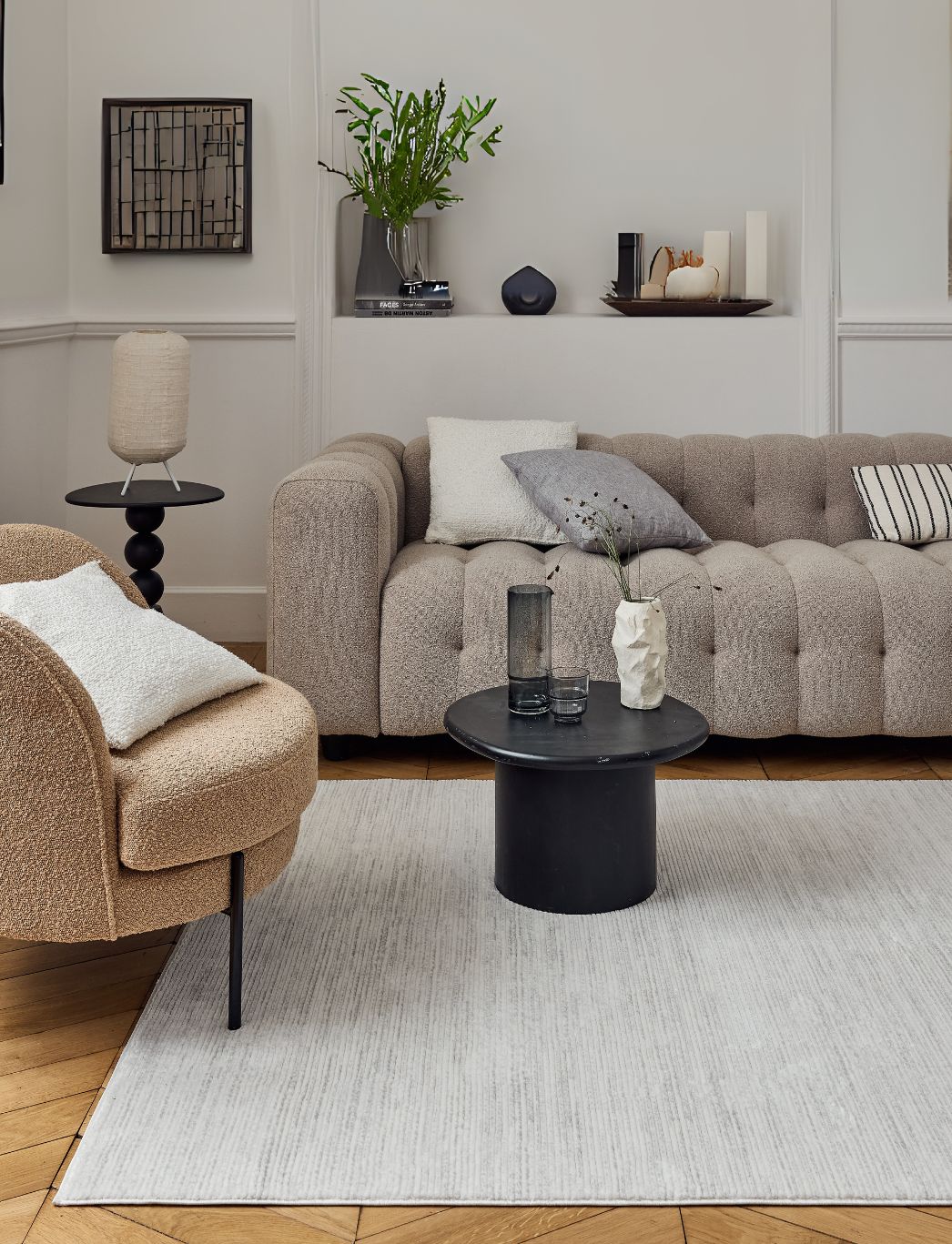
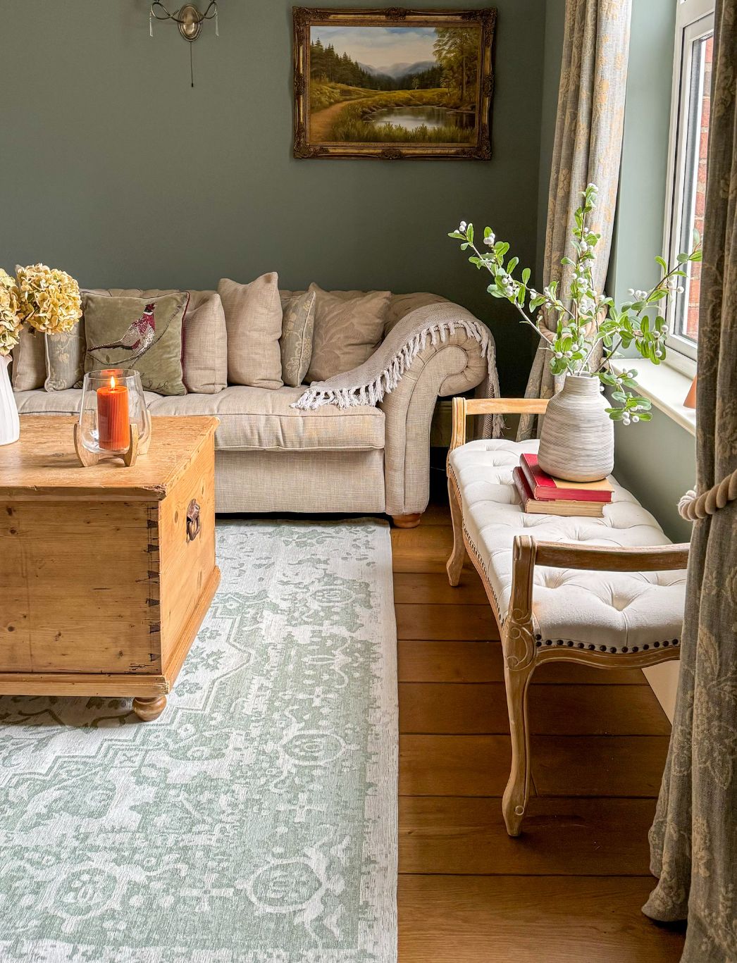
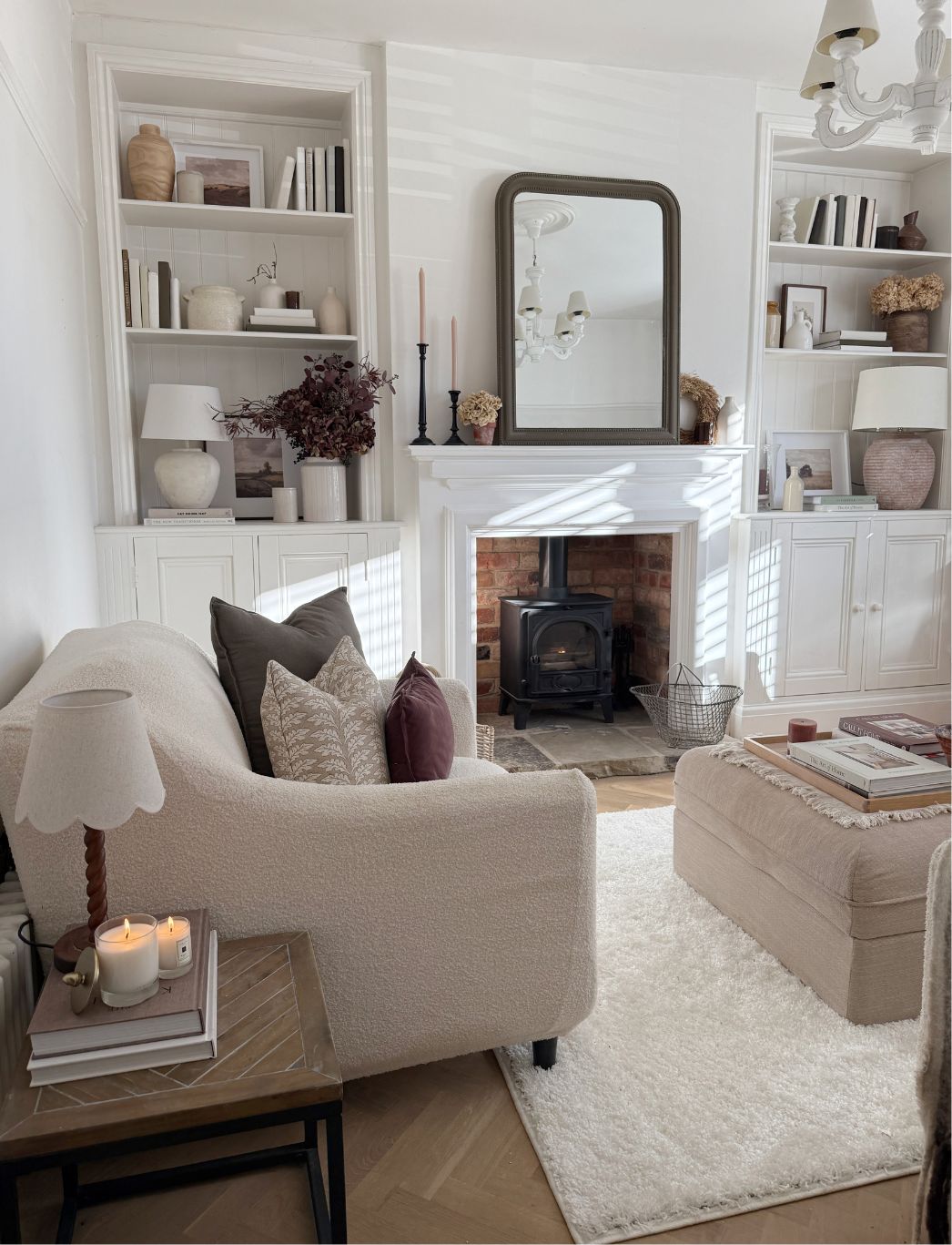
Leave a comment