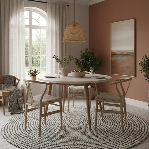
Last year, painted ceilings began climb to the top of homeowners’ and decorators’ to-do lists. And the trend doesn’t appear to be going anywhere! Painting your fifth wall adds another dimension to a room. We suggest choosing pastel décor or peach room décor, similar to the monochrome neutral trend. Soft, soothing ceiling paint like Pressed Petal will help to create a relaxing and stylish space for you in the New Year.
What colour makes a room look elegant?
Deep, rich hues often lend an air of elegance to a room. Shades like navy blue, emerald green, or charcoal grey can create a sophisticated atmosphere. Pair these with metallic accents for added luxury. Soft, muted tones like taupe or dove grey also exude elegance when used thoughtfully in a well-designed space.

What is the most luxurious interior colour?
Gold is often associated with luxury in interior design. A rich, warm gold can instantly elevate a space, creating an opulent atmosphere. However, true luxury lies in how colours are used. Deep jewel tones like sapphire blue or ruby red, when applied correctly, can also create a sumptuous, high-end feel in any room.
What colour is trending in interior design?
In current interior design trends, earthy, nature-inspired tones are gaining popularity. Sage green, terracotta, and warm neutrals are becoming increasingly favoured. These colours bring a sense of calm and connection to nature into living spaces. Additionally, bold, saturated hues used as accents are making a comeback, adding vibrancy to otherwise neutral palettes.

What is colour for elegant house?
An elegant house often features a sophisticated colour palette. Neutral tones like cream, beige, and light grey form an excellent base for elegance. These can be accented with deeper, richer colours like burgundy, navy, or forest green to add depth and interest. The key to an elegant colour scheme is balance and thoughtful application throughout the home.

What colours show elegance?
Colours that show elegance often have depth and subtlety. Classic black and white combinations exude timeless elegance. Rich, deep purples suggest royalty and sophistication. Soft, muted metallics like champagne or rose gold add an elegant shimmer. Even neutral tones, when used in layered, textured applications, can create an air of refined elegance in any space.
Which colour is more elegant?
While elegance can be achieved with various colours, deep navy blue often stands out as particularly elegant. It offers depth and sophistication without being as stark as black. Navy pairs beautifully with crisp whites, warm golds, or soft greys, allowing for versatile and refined design schemes that suit both traditional and modern interiors.
What colour gives off luxury?
Deep, saturated jewel tones often give off a sense of luxury. Emerald green, sapphire blue, and amethyst purple all evoke a feeling of opulence. These rich hues, when used on velvet fabrics or high-gloss surfaces, can transform a space into a luxurious retreat. Pairing these colours with metallic accents further enhances their lavish appeal.
What is the richest looking colour?
Deep purple has long been associated with royalty and wealth, making it one of the richest-looking colours. When used in interiors, a deep aubergine or plum can create an atmosphere of opulence and sophistication. This rich hue pairs well with gold accents, further enhancing its luxurious appeal in any space.
What are the top 5 royal colours?
The top 5 royal colours traditionally associated with monarchy and nobility are:
-
Royal Purple: The most iconic royal hue, symbolising power and luxury.
-
Deep Red: Often called "royal red," it signifies strength and passion.
-
Navy Blue: A regal colour that exudes authority and elegance.
-
Emerald Green: Associated with wealth and prestige.
-
Gold: While not strictly a colour, gold's association with royalty is undeniable.
What colours will be everywhere in interiors in 2025?
Looking ahead to 2025, interior colour trends are likely to embrace nature-inspired hues and calming tones. Expect to see more muted greens, soft terracottas, and warm, earthy neutrals. These colours reflect a growing desire for connection with nature and create serene, grounding spaces. Additionally, bold accent colours like deep teal or burnt orange may gain popularity for adding vibrancy to these natural palettes.
What is the colour rule in interior design?
The most well-known colour rule in interior design is the 60-30-10 rule. This guideline suggests using 60% of a dominant colour, 30% of a secondary colour, and 10% of an accent colour in a room. This balance creates visual interest while maintaining harmony. The dominant colour is often a neutral tone, while the secondary and accent colours can be bolder or complementary hues.
What are luxury colours for interior design?
Luxury colours in interior design often include rich, deep hues and metallic tones. Gold, silver, and copper add instant glamour to any space. Deep jewel tones like emerald green, sapphire blue, and ruby red evoke opulence. Neutral colours like crisp white, warm taupe, or charcoal grey can also feel luxurious when used with high-quality materials and finishes.
What colour gives sophistication and elegance?
Grey, in its various shades, often embodies sophistication and elegance in interior design. From light dove grey to deep charcoal, this versatile colour creates a refined backdrop for any style. Grey pairs well with both warm and cool tones, allowing for sophisticated colour combinations. When used with different textures and finishes, grey can transform a space into the epitome of elegance.
What colour make your house look expensive?
To make your house look expensive, consider using rich, deep colours like navy blue, emerald green, or burgundy. These hues, when used strategically, can create a sense of luxury and depth. Pair them with crisp white trim or metallic accents for added opulence. High-quality neutral tones like warm taupe or soft greige can also make a space feel expensive when combined with luxurious textures and finishes.
What colour looks classy?
Classic black and white combinations consistently look classy in interior design. This timeless colour scheme exudes sophistication and elegance. Black adds depth and drama, while white brings brightness and a sense of spaciousness. Together, they create a high-contrast look that's both striking and refined. This versatile palette can be adapted to various design styles, from traditional to modern, always maintaining its classy appeal.
What colours say luxury?
Colours that say luxury often have depth and richness. Deep jewel tones like sapphire blue, emerald green, and ruby red immediately evoke a sense of opulence. Metallic shades, particularly gold and silver, are synonymous with luxury. Rich, warm neutrals like chocolate brown or deep taupe can also feel luxurious when used with high-quality materials. The key to luxury is not just the colour choice, but how it's applied and paired with textures and finishes.
Which colour represents elegance and timelessness?
Black represents elegance and timelessness like no other colour. It's sophisticated, mysterious, and versatile. In interior design, black can create dramatic focal points or serve as a grounding element. When used judiciously, it adds depth and contrast to any colour scheme. Black's timeless appeal makes it a staple in both classic and contemporary design, always exuding an air of refined elegance.
What colour theory is elegance?
In colour theory, elegance is often associated with monochromatic or analogous colour schemes. These harmonious combinations create a sophisticated, cohesive look. Monochromatic schemes use variations of a single colour, creating depth through different shades and tones. Analogous schemes use colours adjacent on the colour wheel, resulting in a refined, balanced aesthetic. Both approaches can produce elegant interiors when executed with attention to texture and balance.
What colour looks rich?
Deep, saturated hues often look rich in interior design. Colours like burgundy, forest green, and navy blue create a sense of depth and luxury. These colours absorb light, making spaces feel cosy and opulent. When paired with metallic accents or glossy finishes, they enhance the rich appearance. Even neutral colours like charcoal grey or chocolate brown can look incredibly rich when used in high-quality materials and thoughtful design schemes.
What colour is sophisticated?
Charcoal grey is often considered one of the most sophisticated colours in interior design. It's deep and complex without being as stark as black. Charcoal grey provides a refined backdrop for both bold and subtle accent colours. It works well in various design styles, from modern to traditional, always maintaining an air of sophistication. When paired with metallic accents or rich textures, charcoal grey creates an undeniably elegant atmosphere.
What is the fanciest colour?
While fanciness is subjective, gold is often perceived as the fanciest colour. Its association with wealth, luxury, and opulence makes it a top choice for creating fancy interiors. Gold can be incorporated through metallic paint, gilded furniture, or decorative accents. When used judiciously, it adds a touch of glamour and sophistication to any space. Pairing gold with deep, rich colours like navy or emerald can create an even fancier, more luxurious ambiance.
What colour is the most elegant?
Deep navy blue is often considered one of the most elegant colours in interior design. It offers sophistication and depth without the starkness of black. Navy blue creates a rich backdrop that complements a wide range of other colours, from crisp whites to warm golds. It works well in both traditional and modern settings, always maintaining an air of refined elegance. When used on walls or large furniture pieces, navy blue can transform a space into a truly elegant retreat.
What are royal shades?
Royal shades are colours traditionally associated with monarchy and nobility. They include:
-
Royal Purple: The quintessential colour of royalty.
-
Deep Red: Often called "royal red" or "burgundy."
-
Navy Blue: A regal, authoritative hue.
-
Emerald Green: Symbolising wealth and prestige.
-
Gold: While not a true colour, it's intrinsically linked to royalty.
These rich, deep hues evoke a sense of luxury and power when used in interior design.
What colour attracts the human eye most?
Red is widely recognised as the colour that attracts the human eye most. It's a bold, energetic hue that immediately draws attention. In interior design, red can be used strategically to create focal points or add excitement to a space. However, it's important to use red judiciously, as too much can be overwhelming. Accents of red in an otherwise neutral room can create a dynamic, eye-catching design that's both attractive and balanced.
What interior colours make a house look expensive?
To make a house look expensive, consider these colours:
-
Rich Navy Blue: Creates depth and sophistication.
-
Crisp White: Offers a clean, high-end look when used correctly.
-
Warm Grey: Provides an elegant, neutral backdrop.
-
Deep Emerald Green: Adds a touch of luxury and opulence.
-
Soft Taupe: Creates a refined, expensive-looking neutral base.
Pair these colours with high-quality materials and finishes for a truly luxurious feel.
What colour makes you rich?
While no colour can literally make you rich, certain colours can create a perception of wealth and success. Gold is often associated with affluence and luxury. In interior design, using gold accents or a warm, golden colour palette can create an atmosphere of opulence. Deep jewel tones like emerald green or sapphire blue also evoke a sense of richness. The key is to use these colours thoughtfully, pairing them with high-quality materials and elegant design elements.
Which colour looks so expensive?
Deep emerald green often looks incredibly expensive in interior design. This rich, jewel-toned hue exudes luxury and sophistication. When used on walls or large furniture pieces, emerald green creates a sense of opulence and depth. It pairs beautifully with metallic accents, particularly gold, further enhancing its expensive look. The key to making emerald green look truly high-end is to use it with quality materials and thoughtful design elements.
What is the most aristocratic colour?
Purple has long been considered the most aristocratic colour. Historically, purple dye was extremely rare and expensive, making it accessible only to royalty and the very wealthy. In interior design, deep shades of purple like aubergine or plum can create a sense of luxury and refinement. When used judiciously, purple adds a touch of aristocratic elegance to any space, especially when paired with gold accents or rich, quality fabrics.
What is the king of all Colours?
Gold is often regarded as the king of all colours in interior design. Its association with wealth, luxury, and royalty gives it an unparalleled status. Gold can transform a space, adding warmth, opulence, and a touch of glamour. Whether used in small accents or as a dominant colour, gold elevates the entire design scheme. It pairs beautifully with both light and dark colours, making it a versatile choice for creating truly regal interiors.
Which is the colour of cleanliness?
White is universally recognised as the colour of cleanliness. It represents purity, freshness, and hygiene. In interior design, white creates a sense of spaciousness and light, making rooms feel clean and airy. However, using white effectively requires careful consideration. Pair it with different textures to add depth, or use varying shades of white to create a sophisticated, clean look without feeling sterile. White also serves as an excellent backdrop for other colours and design elements.
What colours look futuristic?
Futuristic colour schemes often incorporate:
-
Sleek Silver: Represents technology and innovation.
-
Neon Blue: Evokes digital interfaces and futuristic lighting.
-
Stark White: Creates a clean, minimalist base.
-
Deep Black: Adds drama and contrast.
-
Electric Purple: Adds a touch of sci-fi flair.
Combining these colours with glossy finishes and LED lighting can enhance the futuristic feel in interior design.
What living room colours are trending?
Current living room colour trends include:
-
Sage Green: A calming, nature-inspired hue.
-
Warm Neutrals: Cosy beiges and taupes.
-
Terracotta: Adds warmth and earthiness.
-
Navy Blue: A sophisticated, versatile choice.
-
Soft Pink: Adds a gentle, welcoming touch.
These colours reflect a desire for comfort and connection to nature in our living spaces.
What is the colour of 2026?
As colour trends are typically predicted closer to the year in question, it's challenging to accurately state the colour of 2026 from our current perspective. However, based on current trends and societal shifts, we might expect to see colours that:
-
Reflect environmental consciousness: Perhaps a deep forest green or ocean blue.
-
Promote calmness and well-being: Soft, muted tones like sage or lavender.
-
Embrace technology: Sleek metallic shades or vibrant digital-inspired hues.
The exact colour will depend on future cultural and design influences.
What is the best colour for interior design?
The best colour for interior design varies depending on the space, lighting, and desired atmosphere. However, versatile neutrals like warm grey or soft beige are often considered excellent choices. These colours provide a flexible backdrop for various design styles and colour accents. They can make spaces feel larger and brighter while allowing other design elements to shine. The key is to choose a colour that complements the room's purpose, enhances natural light, and creates the desired mood.
What is the 60 30 10 rule?
The 60-30-10 rule is a classic interior design principle for creating balanced colour schemes. It suggests:
60% of the room should be a dominant colour, usually a neutral or less intense colour.
30% should be a secondary colour, which can be more vibrant.
10% should be an accent colour, often the boldest.
This rule helps create visual interest while maintaining harmony in a space.
What is the golden rule in interior design?
The golden rule in interior design is "form follows function." This principle emphasises that the design of a space should primarily relate to its intended purpose or function. While aesthetics are important, they should not compromise the usability of a space. This rule encourages designers to create spaces that are not only beautiful but also practical and comfortable for their intended use, ensuring a balance between style and functionality.
What is the most elegant colour?
Deep navy blue is often considered one of the most elegant colours in interior design. It offers sophistication and depth without the starkness of black. Navy creates a rich backdrop that complements a wide range of other colours, from crisp whites to warm golds. It works well in both traditional and modern settings, always maintaining an air of refined elegance. When used on walls or large furniture pieces, navy can transform a space into a truly elegant retreat.
What is the most luxurious interior colour?
Rich, deep gold is often regarded as the most luxurious interior colour. It exudes opulence and grandeur, immediately elevating any space. Gold can be incorporated through metallic paint, gilded furniture, or decorative accents. When used judiciously, it adds a touch of glamour and sophistication. Pairing gold with deep, rich colours like navy or emerald can create an even more luxurious ambiance. The key is to balance gold accents to avoid overwhelming the space.
What colour screams luxury?
Deep emerald green often screams luxury in interior design. This rich, jewel-toned hue evokes images of precious gemstones and lush, exclusive spaces. When used on walls or large furniture pieces, emerald green creates a sense of opulence and depth. It pairs beautifully with metallic accents, particularly gold, further enhancing its luxurious appeal. The key to making emerald green truly luxurious is to use it with high-quality materials and thoughtful design elements.
What colour makes a room look elegant?
Soft, muted grey often makes a room look elegant. It provides a sophisticated backdrop that complements various design styles and colour accents. Grey can make a space feel refined and timeless without being as stark as white or as heavy as black. When paired with rich textures and carefully chosen accessories, grey creates an atmosphere of understated elegance. It also allows other elements in the room, like artwork or statement furniture, to stand out beautifully.
What colour makes you look elegant?
While this question seems more related to fashion than interior design, in the context of interiors, colours that make a space look elegant can also reflect elegantly on its occupants. Soft, muted tones like dove grey, pale blush, or warm taupe can create an elegant backdrop that complements various skin tones and clothing choices. These colours create a refined atmosphere that can make anyone in the space appear more elegant by association.
What colour makes you look rich?
In interior design, colours that make a space look rich can create an impression of wealth. Deep jewel tones like sapphire blue, emerald green, or ruby red often create a sense of opulence in a room. These rich hues, when used on quality materials and paired with metallic accents, can make a space feel luxurious and expensive. This, in turn, can create an impression of wealth for those who inhabit or own the space.
What makes house look luxury?
Several elements can make a house look luxurious:
-
Rich, deep colour palettes: Think jewel tones or sophisticated neutrals.
-
High-quality materials: Natural stone, hardwoods, and plush fabrics.
-
Thoughtful lighting: A mix of ambient, task, and accent lighting.
-
Statement pieces: Unique artwork or designer furniture.
-
Attention to detail: Custom finishes and well-curated accessories.
Combining these elements creates a sense of luxury and sophistication in any home.
What colour house is hardest to sell?
While personal preferences vary, very bright or unusual colours can make a house harder to sell. Extreme colours like bright purple, neon green, or stark black may limit appeal to potential buyers. These bold choices can be difficult for buyers to envision living with or costly to change. Neutral colours like beige, grey, or soft white are generally safer choices when selling a home, as they appeal to a broader range of tastes and allow buyers to easily imagine their own style in the space.
Which colour is beautiful for living room?
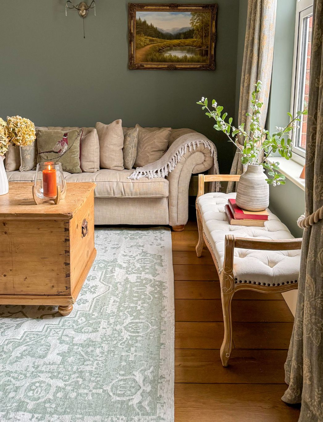
Soft sage green is a beautiful choice for living rooms. It brings a sense of nature indoors, creating a calming and refreshing atmosphere. Sage green works well with various design styles, from modern to traditional. It pairs beautifully with warm neutrals, crisp whites, and natural wood tones. This versatile colour can make a space feel both cosy and sophisticated, perfect for creating an inviting living room where people want to gather and relax.
Which Colour gives luxury?
Deep purple often gives a sense of luxury in interior design. Associated with royalty and opulence, purple, especially in its deeper shades like aubergine or plum, can transform a space into a luxurious retreat. When used on walls or large furniture pieces, it creates depth and richness. Purple pairs beautifully with metallic accents, particularly gold, enhancing its luxurious appeal. The key to using purple effectively is to balance it with neutral tones to avoid overwhelming the space.
How to look elegant and classy?
While this question is more about personal appearance, in terms of interior design, creating an elegant and classy space can reflect on its occupants. To achieve this:
-
Choose a sophisticated colour palette: Neutrals with carefully selected accents.
-
Invest in quality pieces: Well-made furniture and decor items.
-
Keep it uncluttered: Embrace minimalism and thoughtful arrangement.
-
Add subtle luxury: Incorporate rich textures and materials.
-
Pay attention to lighting: Use a mix of ambient and accent lighting.
These elements create an elegant backdrop that can enhance the overall impression of the space and its inhabitants.
What are the colours of sophistication?
Colours of sophistication in interior design include:
-
Charcoal Grey: Deep and complex.
-
Navy Blue: Rich and timeless.
-
Burgundy: Luxurious and refined.
-
Emerald Green: Opulent and striking.
-
Crisp White: Clean and elegant.
These colours, when used thoughtfully, create sophisticated interiors that exude class and refinement.
What colours show elegance?
Colours that show elegance often have depth and subtlety:
-
Soft Taupe: A refined neutral.
-
Pale Blush: Delicate and sophisticated.
-
Deep Navy: Rich and timeless.
-
Muted Gold: Luxurious without being flashy.
-
Charcoal Grey: Sophisticated and versatile.
These colours, when used in high-quality materials and thoughtful combinations, can create truly elegant spaces.
What makes a room feel elegant?
Several elements contribute to making a room feel elegant:
-
Thoughtful colour palette: Sophisticated hues used harmoniously.
-
Quality materials: Fine fabrics, natural woods, and polished metals.
-
Well-proportioned furniture: Pieces that fit the space perfectly.
-
Subtle lighting: A mix of ambient and accent lighting.
-
Curated accessories: Carefully chosen pieces that add interest without clutter.
Combining these elements creates an atmosphere of refined elegance in any room.
What colour is the most luxury?
Rich, deep gold is often considered the most luxurious colour in interior design. It immediately evokes a sense of opulence and grandeur. Gold can be incorporated through metallic paint, gilded furniture, or decorative accents. When used judiciously, it adds a touch of glamour and sophistication to any space. Pairing gold with deep, rich colours like navy or emerald can create an even more luxurious ambiance. The key is to balance gold accents to avoid overwhelming the space.
What are the luxury colours for interior design?
Luxury colours in interior design often include:
-
Deep Emerald Green: Opulent and striking.
-
Rich Navy Blue: Sophisticated and timeless.
-
Burgundy: Luxurious and refined.
-
Metallic Gold: The epitome of luxury.
-
Soft Cream: Elegant and versatile.
These colours, when used with high-quality materials and thoughtful design, create truly luxurious interiors.
What Colour represents luxury?
Gold is the colour that most strongly represents luxury in interior design. Its association with wealth, opulence, and prestige makes it a top choice for creating luxurious spaces. Gold can be incorporated through metallic finishes, gilded furniture, or decorative accents. When used thoughtfully, it adds a touch of glamour and sophistication to any room. Pairing gold with deep, rich colours like navy or emerald can enhance its luxurious appeal even further.
What is the most fanciest colour in the world?
While "fanciest" is subjective, deep purple is often considered one of the fanciest colours worldwide. Historically associated with royalty and luxury due to the rarity and expense of purple dye, it continues to evoke a sense of opulence and exclusivity. In interior design, rich purple hues like aubergine or plum can create incredibly fancy, sophisticated spaces. When paired with metallic accents or luxurious fabrics, purple can transform a room into a truly fancy, high-end environment.
How can I make my room look classy?
To make your room look classy:
-
Choose a sophisticated colour palette: Stick to neutrals with carefully selected accents.
-
Invest in quality pieces: Focus on well-made furniture and decor items.
-
Add texture: Incorporate plush fabrics and interesting textures.
-
Pay attention to lighting: Use a mix of ambient and accent lighting.
-
Keep it uncluttered: Embrace minimalism and thoughtful arrangement.
These elements combined create a classy, refined atmosphere in any room.
What colours make you look sophisticated?
While this question is more about personal appearance, in interior design, colours that make a space look sophisticated can reflect well on its occupants. Consider:
-
Deep Navy: Timeless and refined.
-
Charcoal Grey: Modern and elegant.
-
Soft Taupe: Subtle and classy.
-
Rich Burgundy: Luxurious and mature.
-
Crisp White: Clean and sophisticated.
These colours, when used in high-quality materials and thoughtful design, create sophisticated interiors that can enhance the overall impression of the space and its inhabitants.
Which colour is most attractive for a bedroom?
Soft, muted blue is often considered the most attractive colour for a bedroom. It creates a calming, serene atmosphere conducive to rest and relaxation. Blue is associated with tranquillity and can help lower heart rate and blood pressure, promoting better sleep. Pair it with warm neutrals or soft whites to create a balanced, inviting bedroom. The key is to choose a shade that feels soothing and complements the room's natural light.
What colour looks classy?
Classic black and white combinations consistently look classy in interior design. This timeless colour scheme exudes sophistication and elegance. Black adds depth and drama, while white brings brightness and a sense of spaciousness. Together, they create a high-contrast look that's both striking and refined. This versatile palette can be adapted to various design styles, from traditional to modern, always maintaining its classy appeal. Adding textures and metallic accents can further enhance the classy feel of a black and white scheme.
What colour looks rich?
Deep, saturated jewel tones often look rich in interior design. Colours like emerald green, sapphire blue, and ruby red create a sense of depth and luxury. These colours absorb light, making spaces feel cosy and opulent. When paired with metallic accents or glossy finishes, they enhance the rich appearance. Even neutral colours like charcoal grey or chocolate brown can look incredibly rich when used in high-quality materials and thoughtful design schemes. The key to achieving a rich look is using these colours in luxurious textures and finishes.
What colour makes a room look elegant?
Deep, rich colours often create an elegant atmosphere. Jewel tones like emerald green, sapphire blue, and amethyst purple can add sophistication to a space. For a more subtle elegance, consider warm neutrals like taupe or soft greys. These colours provide a refined backdrop for luxurious furnishings and decor.
What is the most luxurious interior colour?
While luxury can be subjective, certain colours consistently evoke a sense of opulence. Deep, saturated hues like royal purple, midnight blue, or rich burgundy often create a luxurious feel. Metallic accents in gold or silver can elevate any colour scheme to a more luxurious level. For a modern take on luxury, consider deep, earthy tones like chocolate brown or forest green.
What is the colour trend for 2025 interiors?
The colour trends for 2025 interiors are leaning towards warm, earthy tones. Expect to see rich browns ranging from chocolate to caramel, earthy yellows and amber hues, deep reds like oxblood and terracotta, and saturated jewel tones, particularly violet and emerald green. These colours reflect a desire for comfort and connection to nature in our living spaces.
What is the 3 colour rule in interior design?
The 3 colour rule in interior design suggests using three colours in a room's palette: a dominant colour for about 60% of the space (walls, large furniture), a secondary colour for about 30% of the space (accent furniture, textiles), and an accent colour for the remaining 10% (accessories, artwork). This rule helps create a balanced and visually appealing space while avoiding an overwhelming or chaotic look.
What makes a room feel elegant?
Several elements contribute to a room's elegance: a rich, sophisticated colour palette, quality materials like silk, velvet, or fine wood, well-proportioned furniture with clean lines, thoughtful lighting including statement chandeliers or sconces, curated accessories that add personality without clutter, and symmetry and balance in the overall layout. Remember, elegance often comes from simplicity and attention to detail rather than excess.
What colour shows elegance?
Colours that often convey elegance include deep navy blue, rich emerald green, sophisticated charcoal grey, classic ivory or cream, and luxurious burgundy or wine red. These colours create a refined atmosphere when used thoughtfully in a space. Pairing them with metallic accents can further enhance their elegant appeal.
What colour gives off luxury?
Colours that exude luxury often include deep purple or violet, associated with royalty, rich gold, evoking wealth and opulence, midnight blue, creating depth and sophistication, emerald green, reminiscent of precious gems, and warm chocolate brown, suggesting richness and comfort. The key to a luxurious feel is often in the depth and saturation of the colour, as well as how it's paired with textures and finishes.
What is the classiest colour?
While classiness can be subjective, certain colours are often associated with timeless elegance. Black is the epitome of sophistication, navy blue is refined and versatile, crisp white is clean and timeless, soft grey is understated and chic, and deep green offers natural elegance. The classiest colour often depends on context and personal style, but these shades consistently create a polished look when used thoughtfully.
What is the richest looking colour?
Colours that appear rich and luxurious often include deep burgundy or wine red, royal purple, emerald green, sapphire blue, and rich chocolate brown. These colours tend to look expensive due to their depth and intensity. When paired with metallic accents like gold or silver, they can create an even more opulent appearance.
What is the most popular colour for interior walls?
While trends change, some colours remain consistently popular for interior walls. Warm neutrals like beige and greige, soft greys for a modern, versatile backdrop, crisp whites for a clean, fresh look, pale blues for a calming atmosphere, and earthy greens for a connection to nature are perennial favourites. In 2025, we're seeing a shift towards warmer, more saturated tones like rich browns and earthy yellows for a cosy, inviting feel.
Is grey still in style for 2025?
While grey has been a dominant neutral for years, its popularity is shifting in 2025. Warmer tones are taking centre stage, with grey evolving into greige (a blend of grey and beige) or being replaced by earthy neutrals. However, deep, rich greys are still used as sophisticated accents or in combination with warmer hues for a balanced palette.
What is the colour for 2026?
While it's early to predict 2026 colours, trends suggest a continuation of nature-inspired hues. Amber Haze, a green-toned yellow, is emerging as a key colour for 2026. This energizing and rejuvenating shade reflects the ongoing desire for colours that provide comfort and connection to nature.
What is the 60/30/20 rule in decorating?
The 60/30/20 rule is a guideline for creating a balanced colour scheme in interior design. It suggests using 60% of the space for a dominant colour (walls, large furniture), 30% for a secondary colour (accent furniture, textiles), and 10% for an accent colour (accessories, artwork). This rule helps create visual interest while maintaining harmony in the room's design.
What is the 70 20 10 colour rule?
The 70-20-10 colour rule is similar to the 60/30/20 rule but with slightly different proportions. It suggests using 70% of the space for a dominant colour (walls, flooring), 20% for a secondary colour (furniture, curtains), and 10% for an accent colour (accessories, artwork). This rule creates a balanced, cohesive look while allowing for pops of colour and visual interest.
What is the 3-5-7 rule in decorating?
The 3-5-7 rule in decorating suggests using 3 main colours in a room's overall scheme, incorporating 5 forms or shapes for visual variety (e.g., round table, rectangular sofa, square pillows), and including 7 patterns or textures to add depth and interest. This rule helps create a well-balanced, visually appealing space with enough variety to be interesting without becoming chaotic.
How to make a room look posh?
To make a room look posh, choose a sophisticated colour palette with rich, deep tones. Invest in quality furniture with elegant lines. Add luxurious textures like velvet, silk, or high-quality wool. Incorporate metallic accents in gold, silver, or bronze. Use statement lighting fixtures as focal points. Display curated artwork or mirrors with ornate frames. Keep the space clutter-free and well-organised. Remember, less is often more when creating a posh atmosphere.
What makes a bedroom look expensive?
To create an expensive-looking bedroom, invest in high-quality bedding with a high thread count. Choose a plush headboard in luxurious fabric or leather. Install elegant lighting, including bedside lamps and a chandelier. Use rich, deep colours or sophisticated neutrals on walls. Add custom window treatments that puddle on the floor. Incorporate metallic or mirrored accents for glamour. Display curated artwork that complements the room's style. The key is to focus on quality materials and a cohesive design scheme.
How to look more luxurious?
To create a more luxurious appearance in your home, choose a sophisticated colour palette with rich, deep tones. Invest in quality furniture pieces with elegant lines. Add plush textures like velvet, silk, or high-quality wool. Incorporate metallic accents in gold, silver, or bronze. Use statement lighting fixtures as focal points. Display curated artwork or oversized mirrors. Keep spaces clutter-free and well-organised. Add fresh flowers or plants for a touch of natural luxury. Remember, luxury often comes from quality over quantity.
What colours give luxury?
Colours that often convey luxury include deep jewel tones like emerald, sapphire, and amethyst, rich metallics such as gold, silver, and copper, sophisticated neutrals like charcoal grey and creamy ivory, intense darks like midnight blue or chocolate brown, and opulent reds like burgundy or oxblood. The key to a luxurious feel is often in the depth and saturation of the colour, as well as how it's paired with textures and finishes.
What is the colour of the year 2025?
For 2025, several colours are gaining prominence. Violet, a rich, saturated jewel tone, is making waves in interior design. Rumors, a deep, dynamic ruby red, is also trending. Cinnamon Slate, a blend of heathered plum and velvety brown, is emerging as a popular choice. These selections reflect a trend towards deeper, more saturated colours and warm, earthy tones in interior design for 2025.
What colours evoke elegance?
Colours that often evoke elegance include deep navy blue, rich emerald green, sophisticated charcoal grey, classic ivory or cream, luxurious burgundy or wine red, soft blush pink, and muted gold. These colours create a refined atmosphere when used thoughtfully in a space. Pairing them with complementary textures and finishes can enhance their elegant appeal.
What colour is sophisticated and elegant?
Colours that are often considered both sophisticated and elegant include deep navy blue (timeless and versatile), charcoal grey (modern and refined), rich emerald green (luxurious and natural), soft taupe (understated and chic), and burgundy (classic and opulent). These colours work well in various design styles and can be paired with metallic accents for added elegance.
What colour makes you look elegant?
While this question typically relates to fashion, in interior design, colours that can make a space look elegant include classic white (clean and timeless), deep navy (sophisticated and versatile), rich burgundy (opulent and warm), soft grey (understated and chic), and emerald green (luxurious and natural). The key to elegance is often in how these colours are used – with quality materials, thoughtful design, and balanced proportions.
What is a luxury accent colour?
Luxury accent colours can add a touch of opulence to any space. Gold is the ultimate symbol of luxury. Deep purple is associated with royalty. Rich emerald is reminiscent of precious gems. Sapphire blue is deep and mysterious. Crimson red is bold and passionate. These colours work best as accents, paired with neutral backgrounds to create a sophisticated, luxurious atmosphere.
What is the most fanciest colour?
While "fanciest" is subjective, colours often associated with luxury and opulence include royal purple (historically linked to nobility), rich gold (symbolising wealth and extravagance), deep emerald (evoking precious gemstones), vibrant ruby red (bold and passionate), and midnight blue (mysterious and sophisticated). The "fanciest" colour often depends on context and personal taste, but these shades consistently create an upscale, lavish impression.
Can bright colours be elegant?
Yes, bright colours can be elegant when used thoughtfully. The key is in how they're applied. Use bright colours as accents against neutral backgrounds. Choose high-quality materials in bright hues. Pair bright colours with sophisticated textures like velvet or silk. Use clean lines and simple shapes to balance bold colours. Incorporate metallic elements to add refinement. Bright colours like jewel tones (emerald, sapphire, amethyst) can be particularly elegant when used judiciously.
What is a wealthy colour?
Colours often associated with wealth and luxury include gold (the ultimate symbol of riches), deep purple (historically linked to royalty), rich emerald green (reminiscent of precious gems), burgundy (opulent and sophisticated), and midnight blue (deep and mysterious). These colours suggest opulence when used in high-quality materials and paired with elegant design elements.
What is the best colour for elegance?
While elegance can be achieved with various colours, some consistently create an elegant atmosphere. Classic black is timeless and sophisticated. Rich navy blue is versatile and refined. Soft cream is understated and luxurious. Deep emerald green offers natural elegance. Warm taupe is subtle and chic. The key to elegance lies not just in the colour choice, but in how it's applied – with quality materials, thoughtful design, and balanced proportions.
What colour is replacing grey?
Warm earth tones are taking over from grey. Colours like terracotta, sand, and rich browns are becoming increasingly popular, bringing a cosy and natural feel to interiors.
What colour is fashionable for interiors?
Jewel tones are currently fashionable for interiors. Deep, rich hues like emerald green, sapphire blue, and ruby red are adding luxury and depth to spaces.
What is the most popular interior colour now?
Sage green has emerged as a highly popular interior colour. This versatile, nature-inspired hue offers a calming presence while adding a fresh and organic touch to any room.
What is the colour trend for interiors in 2025?
The colour trend for interiors in 2025 is leaning towards:
- Earthy neutrals
- Soft pastels
- Bold, saturated hues
- Nature-inspired greens and blues
- Warm, spicy tones
What colour is replacing grey in 2025?
In 2025, grey is being replaced by warm beiges and soft taupes. These colours offer a similar neutrality but with added warmth and sophistication.
What colour goes against grey?
Mustard yellow is an excellent colour to pair with grey. It provides a vibrant contrast while maintaining a modern and sophisticated look.
Which colour is best for interior?
The best interior colour depends on the space and desired mood, but versatile neutrals like warm white or light beige are often considered ideal. They provide a flexible backdrop for various design styles.
What colour is trending now?
Currently trending colours include:
- Terracotta
- Navy blue
- Olive green
- Blush pink
- Ochre yellow
How to choose wall colour?
To choose a wall colour:
- Consider the room's purpose and desired atmosphere
- Assess the natural light in the space
-
Coordinate with existing furniture and decor
- Use colour psychology to evoke specific moods
-
Test samples on your walls before making a final decision
What is the famous colour in the world?
While preferences vary globally, blue is often cited as the world's most popular colour. Its versatility and calming properties make it a favourite in both fashion and interior design.
Related Blog Posts
Blogs
Interior Design Guides
Colour Trends
Rugs and Wall Colours: Harmonising Your Home Palette
Related Rug Collections
Grey Rugs
Rugs By Colours
Rugs


 Grey Rugs
 Beige Rugs
 Cream Rugs
 White Rugs
 Black Rugs
 Brown Rugs
 Blue Rugs
 Duck Egg Blue Rugs
 Green Rugs
 Pink Rugs
 Multicolour Rugs
 Yellow Rugs
 Red Rugs
 Terra Rugs
 Orange Rugs